Preview image. Unlock full-res
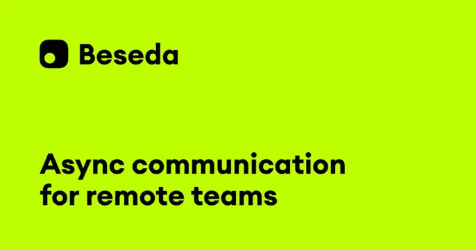
Lime-green OG card with a black logo-and-wordmark lockup top-left and a bold two-line black tagline lower-left.
Summary
A high-energy lime-green card with everything in black, anchoring a logo lockup top-left and a bold tagline bottom-left. The saturated single-color ground is the point.
Visual description
The entire card is a flat, electric lime-green. In the top-left, a black rounded-square app icon containing a small circle sits beside the "Beseda" wordmark in a black bold sans. In the lower-left, the tagline "Async communication for remote teams" is set in a heavy black sans across two lines. The right and central areas are left empty, so the layout reads as two flush-left text blocks anchored to the top and bottom of a bold color field.
Key takeaway
Letting one loud, saturated color do all the work with pure black type on top. Anchoring the logo to the top corner and the tagline to the bottom corner creates a clean diagonal of negative space without any imagery.
Reuse notes
Great for a brand whose identity is a single vivid color and that wants maximum scroll-stopping contrast. Works only when the brand color is bold enough to carry the frame; muted palettes would fall flat. No imagery needed, which makes it fast to template.