Preview image. Unlock full-res
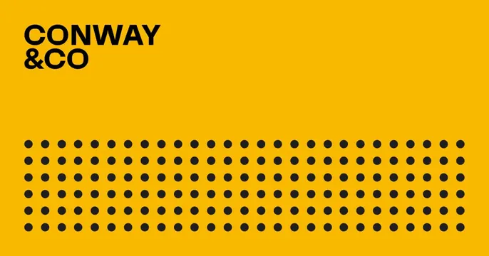
Bright yellow card with the bold black CONWAY and CO wordmark top-left and a large halftone dot grid filling the lower half.
Summary
A two-color card: saturated yellow ground, a tight black wordmark locked into the top-left, and a wide field of black dots across the bottom. Bold, flat, and graphic.
Visual description
The whole card is a single bright marigold yellow. In the upper-left corner the name reads "CONWAY / &CO" in heavy black all-caps, set on two tight lines. The lower half is covered by an evenly spaced grid of small solid black dots, a halftone-style band that spans the full width and grounds the layout. There is no photo, tagline, or URL; the composition is strictly the corner wordmark over the dot field, relying entirely on the yellow-and-black contrast.
Key takeaway
A confident two-color system: one loud flat background, a corner-anchored bold wordmark, and a repeating dot pattern to fill the empty space with texture instead of imagery. It reads instantly at small sizes.
Reuse notes
Good for agencies, studios, or B2B brands wanting a punchy, low-asset card that needs no photography. Swap the single accent color to rebrand. The dot grid is a cheap, reusable way to occupy the lower OG zone without adding content.
More like this







Keep what you find
A free account saves references to boards and can send you a weekly email of picks based on what you save.
To see every result, go Pro.