Preview image. Unlock full-res
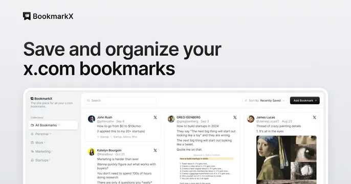
Light OG card with a logo and oversized black headline top-left and a bookmark-manager product screenshot anchoring the bottom.
Summary
A clean light card that states the value in a big black headline up top, then shows the actual bookmark-manager interface filling the lower band.
Visual description
White background. Top left carries the BookmarkX logo mark and black wordmark, with a bold black two-line headline beneath, "Save and organize your x.com bookmarks." The lower two thirds is a product screenshot of the app: a left sidebar with bookmark categories (All Bookmarks, Personal, Work, Marketing, Startups), a top search and "Add Bookmark" bar, and a multi-column feed of saved X posts as cards, one showing a "Girl with a Pearl Earring" thumbnail. The screenshot sits flush to the bottom edge.
Key takeaway
The headline-then-screenshot stack: say exactly what it does in one line, then let a tidy app screenshot prove it. Anchoring the UI flush to the bottom edge implies the product continues beyond the frame.
Reuse notes
A reliable default for any tool with a presentable interface and a one-line value prop. Keep the headline short so it does not crowd the screenshot. The UI must stay legible at OG scale, so favor a clean, uncluttered view.