Preview image. Unlock full-res
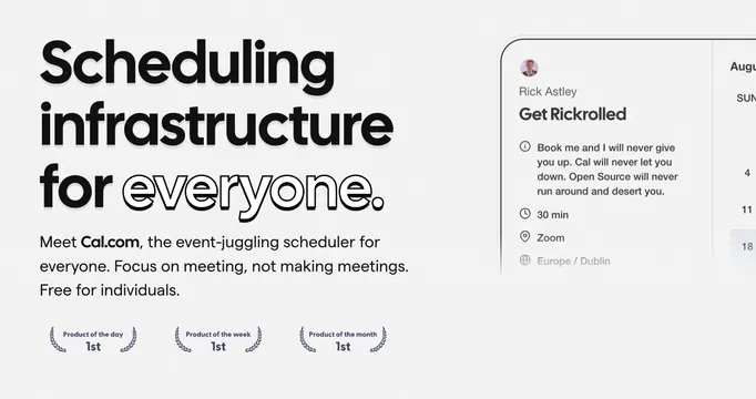
Light OG card with an oversized scheduling headline on the left and a floating booking-page card on the right.
Summary
A clean off-white OG card that pairs an oversized three-line scheduling headline with a partial booking-page UI floating off the right edge. The single outlined word "everyone" inside an otherwise solid headline is the defining move.
Visual description
Light grey background. The left two-thirds carry a massive black sans-serif headline reading "Scheduling infrastructure for everyone," with the last word "everyone" rendered as an outline-only typeface to break the solidity. Below sits a three-line muted sub-paragraph that bolds the "Cal.com" name inline. Under that, three small navy award laurels read "Product of the day / week / month, 1st." The right third shows a rounded booking-card UI bleeding off-canvas: an avatar, a "Get Rickrolled" event title, a playful description, and 30 min / Zoom / Europe-Dublin metadata rows, with a faint month calendar peeking further right.
Key takeaway
Setting one word of a solid headline in an outline weight to add texture without color. Using real product UI cropped off the edge so the card feels like a live screenshot rather than a poster. Stacking compact award laurels as instant social proof.
Reuse notes
Strong default for a productivity or scheduling SaaS that wants warmth without going dark. The cropped UI panel needs a genuinely tidy product screen to carry it. The outline-word trick reads only when the headline is large.