Preview image. Unlock full-res
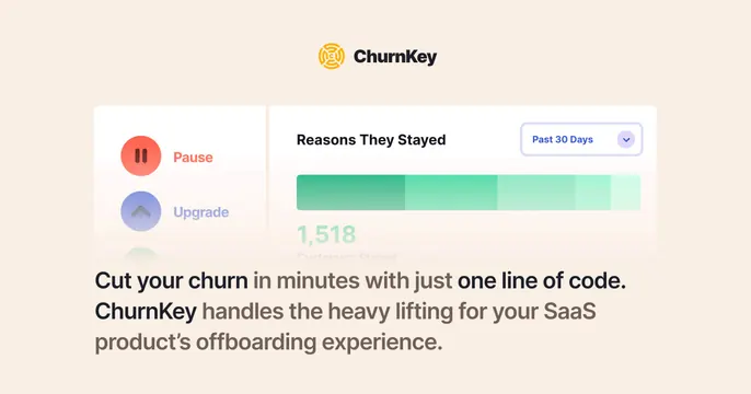
Warm cream Churnkey card with a centered logo, a product UI panel of retention controls, and a two-line value headline.
Summary
A warm cream Churnkey card stacking the centered logo, a floating product-UI panel of retention controls and a stayed-customers chart, and a two-line bold headline about cutting churn.
Visual description
A soft cream background. At top center, the orange circular ChurnKey mark sits beside the bold black "ChurnKey" wordmark. Below, a white rounded product panel splits into a left rail with red "Pause" and blue "Upgrade" buttons and a right area titled "Reasons They Stayed" with a "Past 30 Days" dropdown, a five-segment green gradient bar, and a "1,518 Customers Stayed" figure fading at the bottom. Beneath the panel, a two-line headline in heavy sans-serif mixes black and muted-brown words: "Cut your churn in minutes with just one line of code. ChurnKey handles the heavy lifting for your SaaS product's offboarding experience."
Key takeaway
Centering the logo, then a single real product panel, then a two-weight headline gives a clean top-to-bottom read that explains the product at a glance. Highlighting only the key phrases in full black while greying the rest of the sentence guides the eye through a long headline.
Reuse notes
A dependable B2B SaaS template when you want to show actual UI and state a value prop on one card. The warm cream base softens an otherwise technical product. Keep the UI panel crisp; the small chart labels and faded figure can get hard to read at thumbnail scale.