Preview image. Unlock full-res
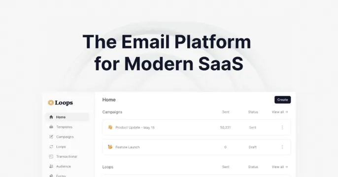
Light grey card with a centered two-line "The Email Platform for Modern SaaS" headline above a clean dashboard screenshot of the Loops campaigns view.
Summary
A stacked SaaS card: a centered two-line headline sits over faint background arcs, with a clean product dashboard screenshot anchored across the bottom.
Visual description
A very light grey card with subtle concentric arc lines faintly radiating behind the text. Centered at top, "The Email Platform for Modern SaaS" is set in a dark navy bold sans across two lines. Below, a crisp dashboard screenshot of the Loops app fills the lower portion: a left sidebar (Home, Templates, Campaigns, Loops, Transactional, Audience, Forms) with the Loops logo, and a "Home" panel listing campaign rows (Product Update, May 15 / Sent 50,231, Feature Launch / Draft) with Sent, Status and View-all columns and a black Create button. The whole thing is calm and product-forward.
Key takeaway
The headline-over-screenshot stack with faint radiating arcs behind the type to add depth without color. Showing a real, legible dashboard sells "this is a polished product" more than any illustration would.
Reuse notes
A go-to for SaaS tools whose UI is the proof. Crop the screenshot so the most legible part (sidebar plus a clean list) sits front and center; keep the headline short so it does not compete with the interface below.