Preview image. Unlock full-res
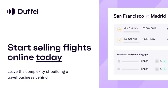
White-and-lavender split card with the Duffel logo and "Start selling flights online today" headline on the left and a flight-booking UI card on a purple panel at right.
Summary
A clean card split between a white copy column on the left and a lavender panel on the right holding a flight-booking interface, headlined "Start selling flights online today."
Visual description
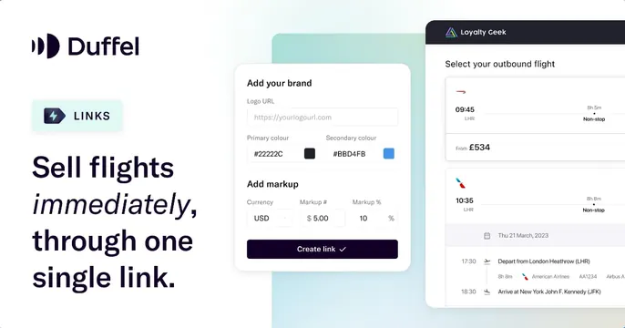
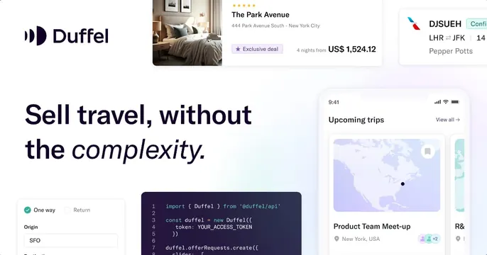
The left two-thirds is white: the Duffel logo and wordmark at top, then an oversized near-black headline "Start selling flights online today" with "today" underlined, and two lines of gray sub-copy below. The right third is a soft lavender panel with faint geometric facets; floating on it is a white booking-UI card titled "San Francisco to Madrid" with two flight rows (dates, times, airline icons) and a "Purchase additional baggage" section showing price rows with minus/plus steppers. The UI card bleeds off the right edge.
Key takeaway
The two-tone split, neutral copy side versus colored product side, is a reliable OG pattern that keeps the headline readable while still showing the interface. Underlining one word in the headline cheaply emphasizes the call to act.
Reuse notes
Good default for a B2B SaaS or API with a visual product UI. Swapping the panel color reskins it easily. Keep the floating UI card to one clear feature; the cropped edge implies more without clutter.