Preview image. Unlock full-res
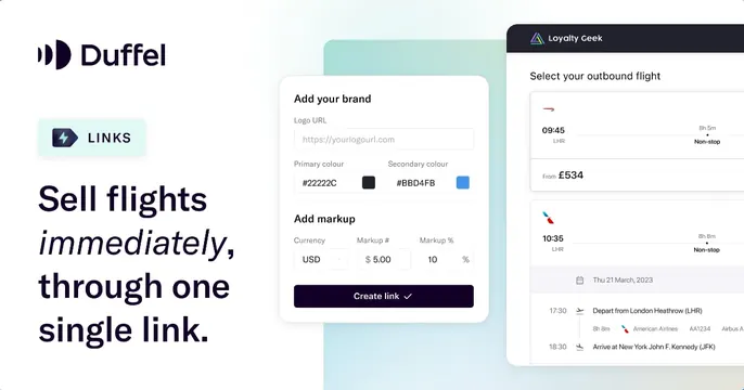
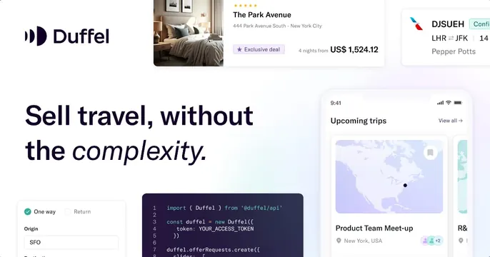
White card with the Duffel logo and an italic-accented headline "Sell travel, without the complexity," surrounded by floating hotel, flight, trips, code and booking UI cards.
Summary
A white card with the headline "Sell travel, without the complexity" set lower-left while a scatter of product UI cards (hotel, flight confirmation, code, trips, booking form) floats around the frame.
Visual description
Clean white background. The Duffel logo sits top-left; the oversized near-black headline "Sell travel, without the complexity" anchors the lower-left, with "complexity" in italic. Around it float overlapping UI fragments cropped by the edges: a top hotel card for "The Park Avenue" with a room photo, star rating and price; a flight-confirmation card top-right with airline mark and route LHR to JFK; a phone mockup at right showing "Upcoming trips" over a map of North America; a dark code-editor snippet importing the Duffel API; and a booking form lower-left with One way/Return toggle and an Origin field. The fragments suggest a full travel stack.
Key takeaway
Scattering many small, half-cropped product cards around a calm headline implies breadth (hotels, flights, trips, code) without a structured grid, reading as "this does everything." A monospace code card among polished UIs signals it is developer-facing too.
Reuse notes
Good for a platform spanning several surfaces that wants to show range on one card. Risk of clutter, so keep the headline area clear and let cards bleed off-edge. Works on plain white where varied UI screenshots can coexist.