Preview image. Unlock full-res
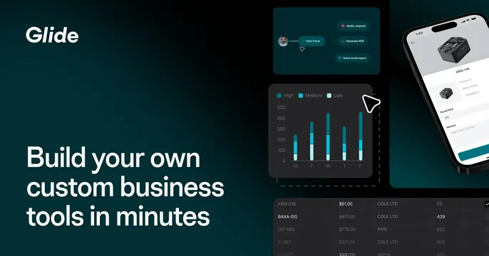
Dark teal left-aligned OG card with a bold no-code app-builder headline beside layered workflow, chart, phone, and data-table mockups.
Summary
A dark teal card with the Glide wordmark and an oversized "Build your own custom business tools in minutes" headline on the left, and a cluster of overlapping product UI panels (workflow, bar chart, phone, data table) on the right. The defining move is collaging several feature surfaces into one depth-stacked product montage.
Visual description
Deep teal-to-black gradient background. Top left holds the white "Glide" wordmark; below it a large white sans-serif headline runs four lines. The right two-thirds layers dark product panels: a node-based workflow ("Part Fixed" leading to Notify channel, Generate PDF, Send email report), a stacked bar chart of inventory levels by weekday with a High/Medium/Low legend, a black iPhone showing a product-detail screen with a part image and quantity field, and a data table of SKUs, prices, and vendors fading off the bottom. Thin dashed selection outlines and cursor arrows imply an editing canvas.
Key takeaway
Showing breadth of a no-code platform by overlapping a workflow, a chart, a mobile output, and a data source in one frame, so the viewer reads "this builds many things." The dark teal keeps the busy montage cohesive.
Reuse notes
Good for no-code, internal-tools, or data-app platforms that need to convey versatility fast. Works best at full OG width since the right-side panels bleed off the edge. Requires polished, legible product screenshots to avoid looking cluttered.