Preview image. Unlock full-res
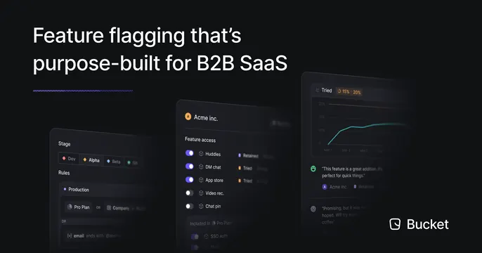
Dark OG card with a headline top-left and three angled, overlapping product UI panels fanned across the lower right, brand mark in the corner.
Summary
A dark card that states the value top-left and fans three tilted, overlapping product panels across the lower right to show the feature-flagging UI.
Visual description
Deep navy-black background. Top left carries a white two-line headline, "Feature flagging that's purpose-built for B2B SaaS," underlined by a short blue accent dash. The lower-right two thirds holds three dark UI cards set at a slight perspective tilt and overlapping each other: a "Stage" / "Rules" config panel on the left, an "Acme inc." feature-access panel with rows of toggles in the middle, and a "Tried" panel with a teal line chart and a short testimonial on the right. The white Bucket logo and wordmark sit in the bottom-right corner.
Key takeaway
The fanned, slightly tilted stack of overlapping panels reads as a real product without showing a flat full screenshot; the perspective adds depth and lets three views coexist. Anchoring the wordmark in the opposite corner from the headline balances the asymmetric layout.
Reuse notes
Good for a B2B SaaS whose value is best shown through several UI states at once. Tilting and overlapping panels keeps them small, so use only the most legible fragments. Works best on dark, with one accent color tying the panels together.
More like this




Keep what you find
A free account saves references to boards and can send you a weekly email of picks based on what you save.
To see every result, go Pro.