Preview image. Unlock full-res
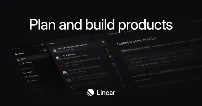
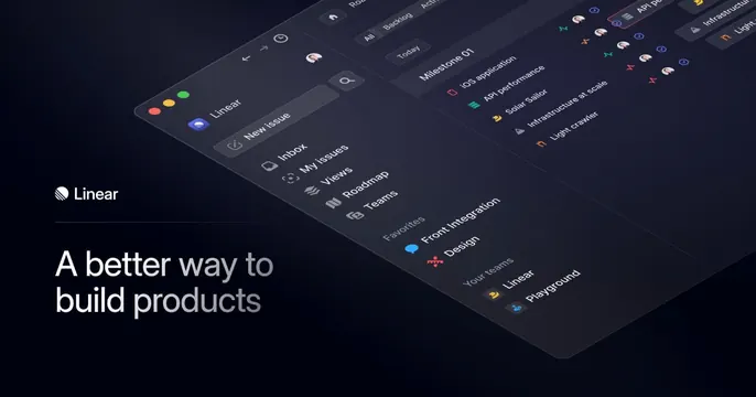
Left-aligned wordmark and oversized "A better way to build products" headline beside an angled dark app screenshot.
Summary
A split dark card with the Linear wordmark and an oversized headline on the left and a perspective-tilted app screenshot filling the right.
Visual description
Near-black background. Left side holds the Linear logo and wordmark up top, a thin divider rule, then a large two-line white headline reading "A better way to / build products". The right two-thirds shows the Linear app rendered in 3D perspective, tilted away from the viewer: a command sidebar (New issue, Inbox, My issues, Views, Roadmap, Teams, Favorites) and a roadmap pane with milestones and colored issue icons, fading into the dark at the top edge. Type is white-on-black throughout.
Key takeaway
The two-column rhythm of left-aligned wordmark plus big benefit headline against a right-side screenshot shown in perspective. The angled UI adds depth and motion versus a flat, straight-on capture.
Reuse notes
A reliable layout for a dev or product tool that wants both a clear message and proof of the interface. The perspective render needs a clean, content-rich screen to look good. Keep the left column sparse so the headline carries; works only on a dark ground here.