Preview image. Unlock full-res
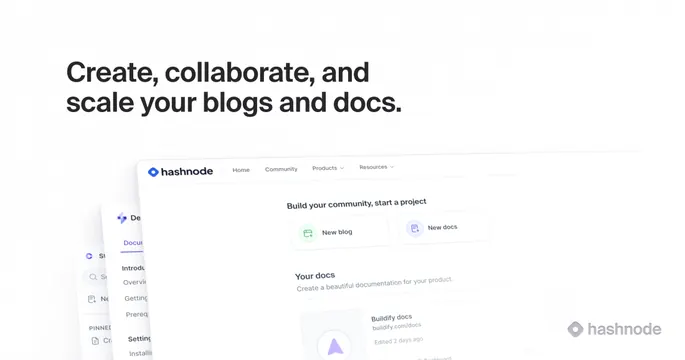
Light OG card with a bold sans-serif headline top-left and tilted, overlapping product screenshots of a blog and docs builder filling the lower portion.
Summary
A light card that leads with a heavy black headline and fills its lower half with tilted, overlapping screenshots of the product. The defining move is the cascade of angled UI windows reading bottom-up.
Visual description
Off-white background carrying a faint dotted-grid texture. The top-left holds a bold near-black sans-serif headline on two lines, "Create, collaborate, and scale your blogs and docs." Below and to the right, several product screenshots overlap at a slight tilt: a foreground "hashnode" dashboard with "Build your community, start a project" and New blog / New docs cards, plus a docs-editor panel layered behind it on the left. A faint grey "hashnode" wordmark sits in the lower-right corner. Cool greys, soft shadows, small purple/blue accents in the UI.
Key takeaway
Tilting and overlapping multiple product screenshots so one card communicates several features at once. Anchoring with a heavy, high-contrast headline while keeping the UI light and secondary.
Reuse notes
Good for developer or content platforms that want to show breadth of product in a single card. Needs polished, on-brand UI captures. The tilt and overlap can hide important UI detail, so keep the headline carrying the message.