Preview image. Unlock full-res
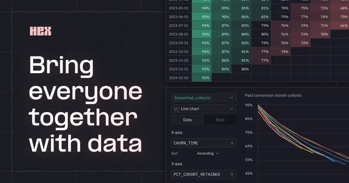
Dark data-tooling OG card with a bold white headline at left over a dense analytics table and line chart, accented by a small logo badge.
Summary
A compact dark card leading with a bold white left-aligned headline set against a dense data table and a line chart. The defining feature is the data-heavy product UI used as the backdrop.
Visual description
Dark charcoal background. A small "HEX" logo badge sits top-left, above an oversized white sans-serif headline stacked on three lines, "Bring everyone together with data." Behind and to the right, the product UI shows a dense color-coded percentage table (a heatmap of values) along the top, and below it a configuration panel ("Financial metrics," chart type, axis controls) beside a multi-line time-series chart with teal and warm accent lines. Tight, technical, high information density; teal as the dominant accent.
Key takeaway
Using a genuinely data-dense UI (a heatmap table plus a chart) as the hero backdrop to instantly signal an analytics product. Keeping the headline short and bold so it survives over busy content.
Reuse notes
Good for data, BI, or notebook tools whose value is the richness of the data view itself. Requires real, legible-at-a-glance UI; clutter only works if the headline stays dominant. Reads best on dark.
More like this



Keep what you find
A free account saves references to boards and can send you a weekly email of picks based on what you save.
To see every result, go Pro.