Preview image. Unlock full-res
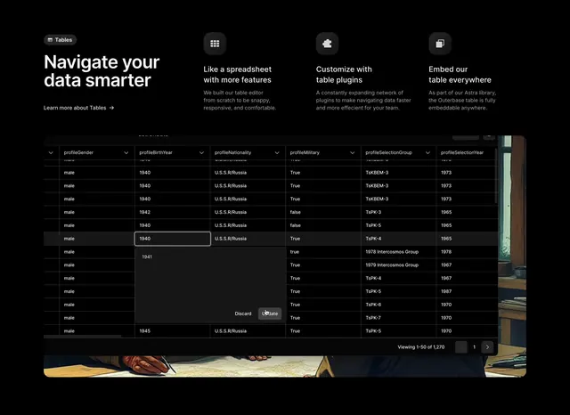
Dark features section pairing an oversized headline and a three-column icon benefit row with a wide, dense product data-table screenshot bleeding over a faint painting.
Summary
A dark features section that places an oversized headline and a three-column icon benefit row at the top, then anchors a wide, dense product data-table screenshot below. The defining move is showing a real spreadsheet-style data grid full of rows as the proof of the feature.
Visual description
On a near-black ground, the upper area splits a small dark "Tables" pill badge and a two-line bold white headline "Navigate your data smarter" on the left, with three benefit columns to its right. Each benefit pairs a small rounded dark icon tile with a short bold heading and grey copy: "Like a spreadsheet with more features," "Customize with table plugins," and "Embed our table everywhere." A "Learn more about Tables" link sits under the headline. Below stretches a wide product screenshot of a dark data table with column headers (profileGender, profileBirthYear, profileNationality, profileMilitary, and more) and many dense rows of cell values, a row-edit menu, and a "Viewing 1-50 of 1,270" pagination control bottom-right. The table is overlaid on a faint, dark classical-painting background that bleeds to the edges.
Key takeaway
Pairing a compact three-up icon benefit row with one large, genuinely dense data-table screenshot so the claim "navigate your data smarter" is shown, not just stated. The faint painting bleeding behind the table to add atmosphere without distracting from the UI. Surfacing real table chrome like a row count and pagination to signal scale.
Reuse notes
Well suited to a data or developer tool whose core value is a powerful table or grid UI. The dense screenshot needs to be high-resolution and legible to work; a blurry grid would undercut it. The source tagged Tabs, but the visible interface is a paginated table rather than a tab control, so components reflect the table.