
Preview image. Unlock full-res
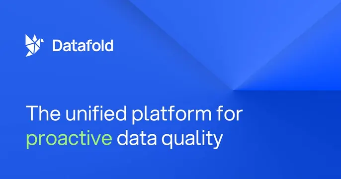
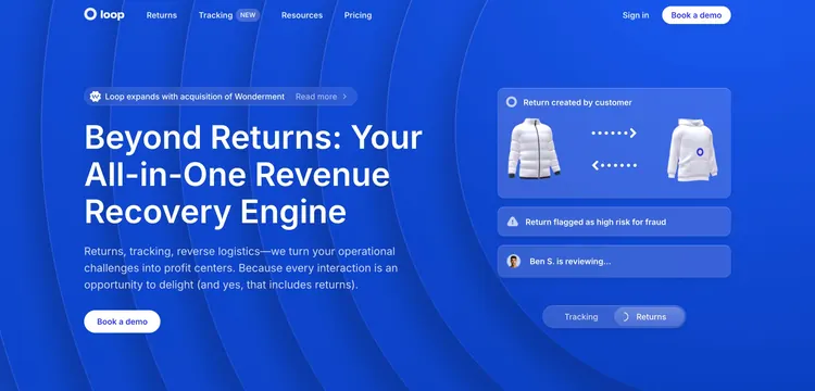
Minimal blue OG card with a small logo lockup top-left and a left-aligned white headline over concentric ripple lines.
Summary
A flat royal-blue OG card carrying just a small logo lockup and a three-line white headline, set against faint concentric ripple lines radiating from the upper right.
Visual description
A saturated royal-blue field fills the whole card. Top-left is a small lockup: a circular ring mark next to the lowercase "loop" wordmark in white. Subtle, slightly darker concentric arcs ripple outward from the top-right corner, giving quiet texture without distracting. The lower-left holds the headline "The returns operations platform for scaling brands" in bold white sans-serif across three lines. No buttons, photos, or product UI; the composition is deliberately spare.
Key takeaway
Doing an entire card with one brand color, a small logo, and a single headline. The barely-there concentric ripple adds depth and a sense of motion to a flat fill without competing with the type.
Reuse notes
A safe, on-brand default when you have a strong brand color and want maximum legibility in a crowded feed. Best when the headline is short and punchy. The faint pattern only reads on a solid, mid-saturation background.
More like this


Keep what you find
A free account saves references to boards and can send you a weekly email of picks based on what you save.
To see every result, go Pro.