Preview image. Unlock full-res
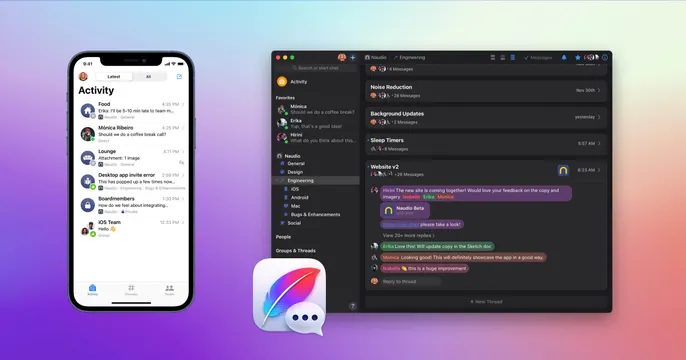
Purple-gradient OG card showing phone and desktop mockups of a team-chat app with its icon floating between them.
Summary
A purple-gradient product card showing a team-chat app on phone and desktop at once, with its app icon perched where the two devices meet.
Visual description
A vibrant violet-to-pink gradient fills the background. On the left, an iPhone mockup displays an "Activity" feed of message threads with avatars and timestamps. On the right, a larger Mac desktop window shows the chat app proper: a left channel sidebar (General, Design, Engineering), a threaded "Website v2" conversation, and reply previews. Centered low between the two devices floats the Quill app icon, a white feather merged with a chat bubble on a dark rounded tile. The two real product surfaces and the gradient carry the card; there is no headline or wordmark beyond the icon.
Key takeaway
Pairing a phone and a desktop mockup to signal "works everywhere" in one frame, with the app icon bridging the two as the focal anchor. The saturated gradient ground makes flat device screenshots feel rich and branded.
Reuse notes
The standard cross-platform move for a messaging, collaboration, or productivity app. Keep the two device screens showing complementary views (overview on mobile, depth on desktop) rather than the same screen twice. A bold brand-color gradient is doing the differentiation here; on a plain ground the card would read generic.