Preview image. Unlock full-res
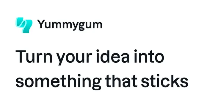
Clean white OG card with the Yummygum logo and name up top and a bold two-line sans headline below.
Summary
A crisp white OG card with a small Yummygum logo lockup in the top-left and a bold dark two-line headline filling the lower area.
Visual description
The card is pure white with a left-aligned layout. At the top-left, a small teal-to-cyan gradient icon (an abstract interlocking ribbon mark) sits beside the "Yummygum" name in a medium-weight dark sans-serif. Below it, taking up the lower two-thirds, a large two-line headline in bold near-black sans-serif reads "Turn your idea into something that sticks." The type is set tight and left-aligned, dominating the composition, with generous white space to the right. No imagery or decoration beyond the small brand icon; the design is clean and message-first.
Key takeaway
The simple, reliable formula of a small top-left logo lockup over a big bold headline on white. It scales well, reads instantly at thumbnail size, and the lone gradient icon adds just enough color to a monochrome layout.
Reuse notes
A dependable default for agencies, studios, and SaaS that want a clean, text-driven share card. Easy to template: drop in any logo and swap the headline. The single gradient accent keeps it from feeling sterile; lean on a strong, short headline since type is the entire design.
More like this


Keep what you find
A free account saves references to boards and can send you a weekly email of picks based on what you save.
To see every result, go Pro.