Preview image. Unlock full-res
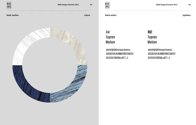
Two-panel brand design guideline showing circular color swatch wheel with material textures and typography specimen page for Tungsten typeface.
Summary
A two-panel brand guideline reference for the Black Surfers 2012 identity, presenting a material-based color swatch wheel and typography specifications.
Visual description
Left panel shows a circular color reference wheel segmented into sections, each filled with distinct material textures: white linen or fabric, cream woven texture, dark navy corduroy, and light blue crosshatch pattern. Right panel presents typography specifications including typeface name "Tungsten," weight "Medium," with character samples showing lowercase, uppercase, numerals, and special characters at two different weights. The layout uses a light gray background with dark text and crisp grid structure. The overall execution is clean, minimal, and reference-focused.
Key takeaway
Using material textures in color references to communicate how a palette manifests in real applications. The grid-based typography showcase demonstrates character coverage and weight variation clearly and efficiently.
Reuse notes
Strong reference for brand guideline documentation, especially when color and typography are primary identity drivers. The material-based approach to color swatches is useful for brands working across multiple fabrications or finishes. Note: This item is a design/branding document, not a photographic subject, and may belong in a design-focused category.
More like this

Keep what you find
A free account saves references to boards and can send you a weekly email of picks based on what you save.
To see every result, go Pro.