Preview image. Unlock full-res
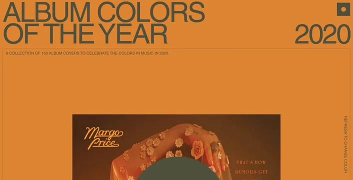
A bold website hero for a music album collection featuring oversized sans-serif headline on a solid burnt-orange background with scrolling album-cover thumbnail.
Summary
A web hero for a music album collection featuring bold, oversized sans-serif type reading "ALBUM COLORS OF THE YEAR" and "2020" over a solid burnt-orange background, with album thumbnails beginning to scroll into view below.
Visual description
A full-width website hero in warm burnt-orange. The main headline spans most of the width in large, geometric sans-serif: "ALBUM COLORS" on the first line, "OF THE YEAR" on the second, rendered in a darker gray-green. The year "2020" appears in the upper right. Below, a subtitle in smaller sans-serif explains the concept: "A COLLECTION OF 150 ALBUM COVERS TO CELEBRATE THE COLORS IN MUSIC IN 2020." Further down, the top of an album cover (Margo Price) begins scrolling into view, with warm and earthy tones visible.
Key takeaway
Simple, bold typography on a solid color background can be more effective than complex imagery. The color choice (burnt-orange) is both warm and distinctive, making the page memorable. Letting the scroll preview the content below invites interaction.
Reuse notes
Strong pattern for music or entertainment websites. Works for any curated collection presented thematically. The burnt-orange palette is on-trend and warm; consider similar color choices for creative industries. Oversized type hierarchy ensures readability at any screen size.
More like this



Keep what you find
A free account saves references to boards and can send you a weekly email of picks based on what you save.
To see every result, go Pro.