Preview image. Unlock full-res
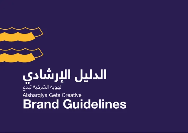
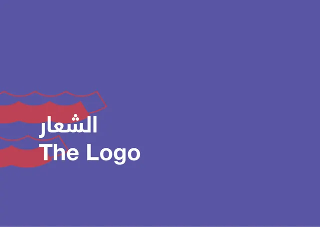
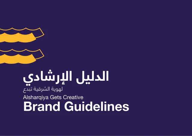
Title cover with golden wave motif top-left and a bilingual Brand Guidelines lockup low-left on deep purple.
Summary
The deck cover: a deep purple field with the golden wave motif stacked in the top-left and a bilingual Arabic and English "Brand Guidelines" title set low on the left.
Visual description
Full-bleed deep indigo-purple background. Two rows of the brand's signature wave shape sit in the upper-left corner, rendered as solid golden-yellow forms with thin yellow outline echoes above them. The lower-left quadrant carries the title block: a large Arabic display headline, a smaller Arabic subtitle beneath it, then the English line "Alsharqiya Gets Creative" in light sans, and finally "Brand Guidelines" in heavy white sans as the dominant element. The entire right two-thirds of the page is left empty.
Key takeaway
Anchoring the cover with the wave motif in one corner and the title in the diagonal-opposite corner, leaving most of the canvas open. The bilingual stack reads cleanly because the heaviest weight is reserved for the single most important line.
Reuse notes
A reusable cover pattern for bilingual identity decks: corner motif plus opposite-corner title on a flat brand color. Works when the background color is strong enough to carry large negative space. The yellow-on-purple pairing is high energy and high contrast.
From this deck: Alsharqiya Gets Creative cover
View deck
More like this





Keep what you find
A free account saves references to boards and can send you a weekly email of picks based on what you save.
To see every result, go Pro.