Preview image. Unlock full-res
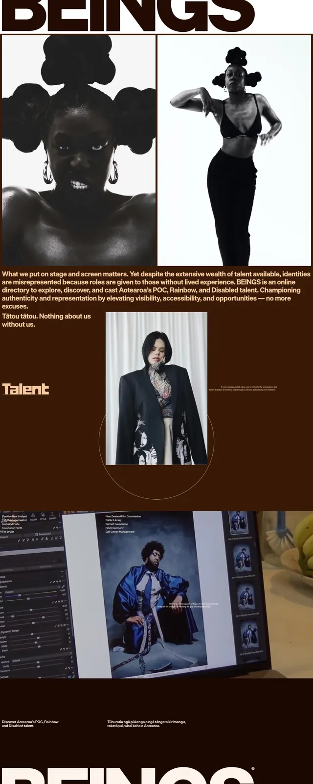
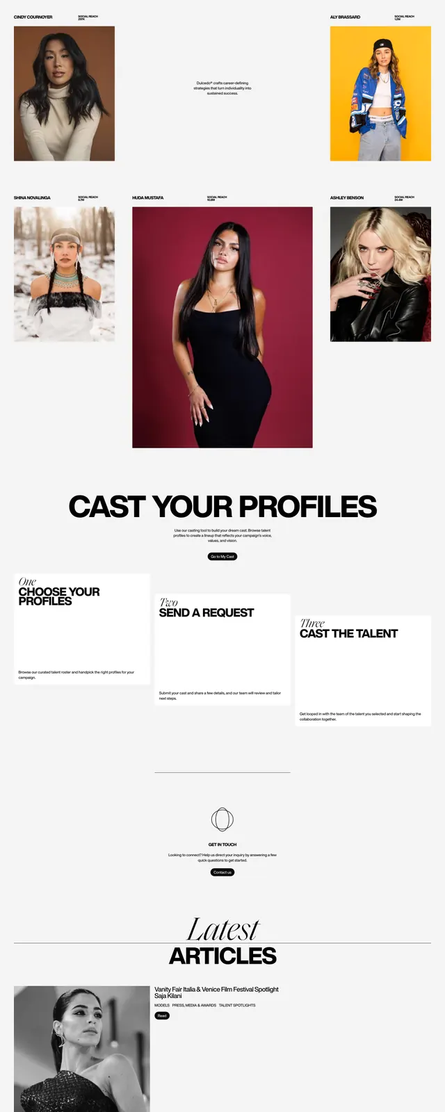
A dark editorial portfolio homepage with oversized name typography, sparse navigation, and a glowing red gradient accent.
Summary
A dark editorial portfolio homepage with oversized name typography, sparse navigation, and a glowing red gradient accent.
Visual description
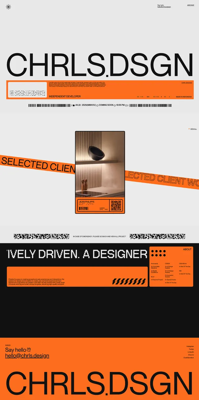
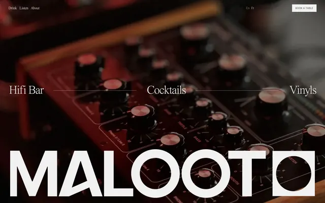
The page uses a black full-bleed background with very thin vertical grid lines and a huge white all-caps name stretched across the top. A sparse navigation sits above the headline, while a warm red-orange glow rises from the lower edge of the first screen. Lower on the page, a tilted grayscale portrait card is centered above a short text block, and the footer area repeats the name with small links and contact text.
Key takeaway
The strongest move is the contrast between massive identity typography and nearly empty negative space. The warm glow against the black field adds energy without breaking the minimal, high-contrast feel.
Reuse notes
Useful for personal portfolios, creative studios, and agency intros where the brand name is the hero. It works best when the identity wordmark is strong and the page can stay sparse with only a few supporting sections.