Preview image. Unlock full-res
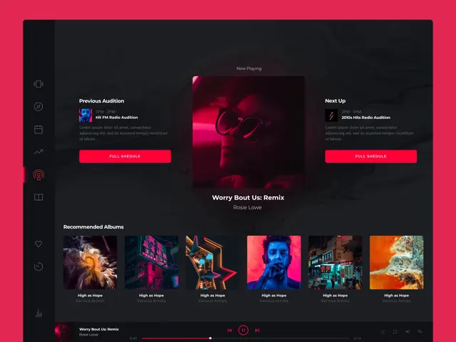
A screenshot of a dark-mode music streaming app UI showing a 'Now Playing' radio screen with album artwork, recommended albums grid, bright magenta accent color, and playback controls.
Summary
A dark-mode music streaming application interface featuring a centered 'Now Playing' section with a large album cover, flanked by 'Previous Audition' and 'Next Up' panels, with a recommended albums grid below and bright red accent buttons.
Visual description
Dark charcoal background with a left sidebar containing icon navigation. The main content area displays a central album artwork with "Now Playing" label, flanked by two information panels for previous and next tracks with red "FULL SCHEDULE" buttons. Below is a "Recommended Albums" section showing a horizontal grid of 6 album covers in a row. The prominent accent color is a bright red/magenta (#DE3355) used on buttons and interactive elements. Bottom playback controls include previous/play/next buttons and a progress bar. Typography is clean, modern sans-serif in light gray and white on dark backgrounds.
Key takeaway
Effective dark-mode UI design using strategic color contrast. The bright red accent creates clear call-to-action zones while maintaining visual hierarchy. The symmetric layout around the centered "Now Playing" section creates balance and focus.
Reuse notes
Strong reference for music streaming or media player interfaces, especially in dark-mode contexts. The balanced three-column layout and accent color strategy works for any app with primary/secondary content sections. The album grid pattern is effective for showcasing curated collections. Use as inspiration for dark-mode interface patterns, contrast strategies, and how bright accents guide user attention in low-light interfaces.
More like this



Keep what you find
A free account saves references to boards and can send you a weekly email of picks based on what you save.
To see every result, go Pro.