
Preview image. Unlock full-res
A 30-page Bitcoin fintech brand guideline built on a bold red, deep-neutral palette with a gear-B logo, futuristic display headers, and a dotted world-map motif.
Summary
The Byte Federal Brand Guidelines 2026 is a 30-page identity system for a Bitcoin fintech company, organized into Introduction, Logo Architecture, Typography, Color System, Visual Elements, and Application. Its defining move is a high-contrast red-and-black scheme anchored by a cog-shaped B mark and recurring dotted world-map and halftone graphics.
Visual description
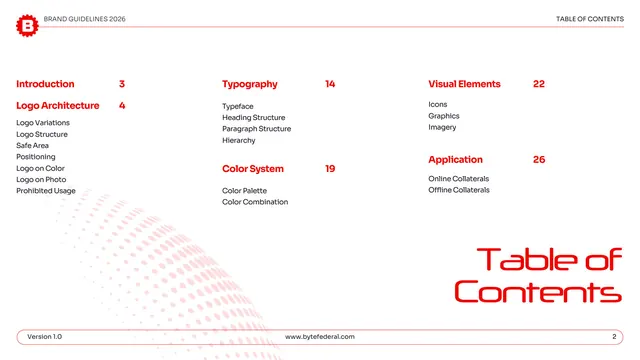
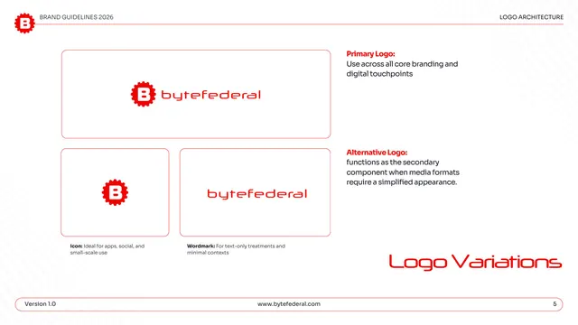
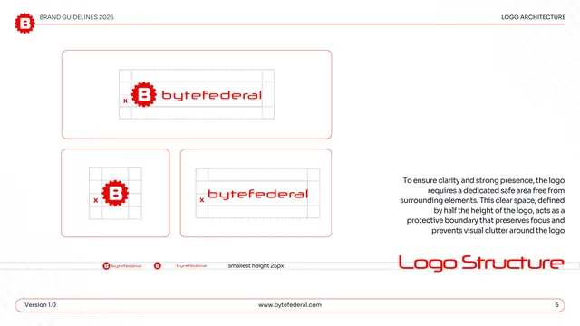
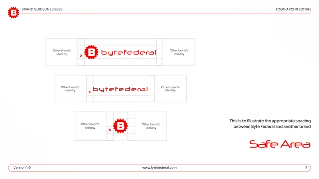
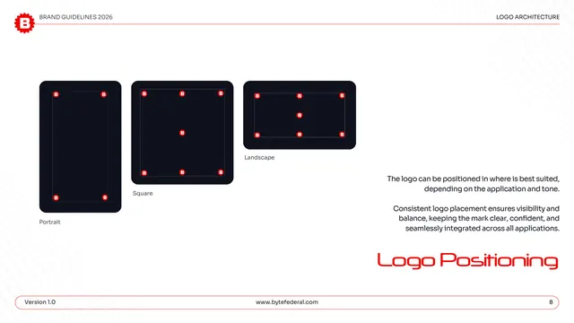
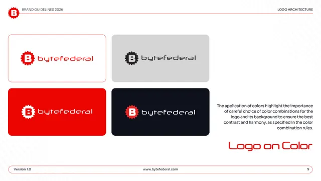
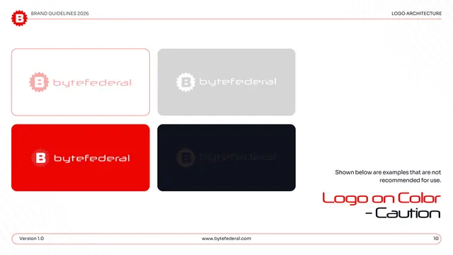
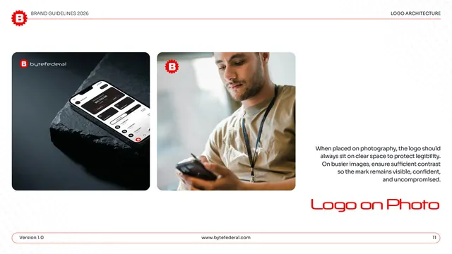
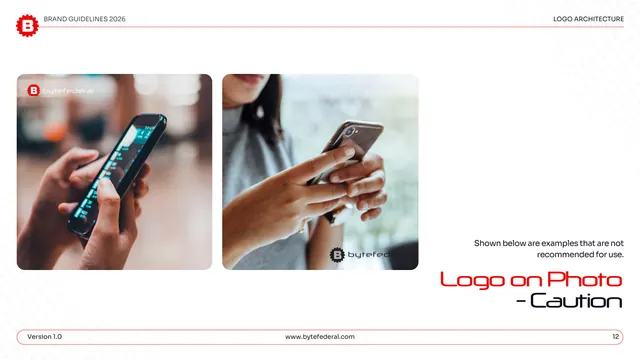
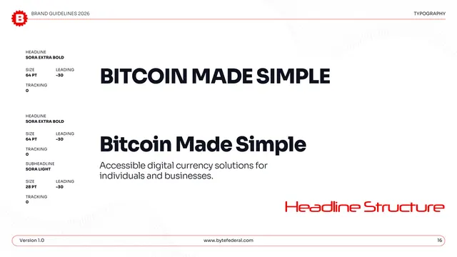
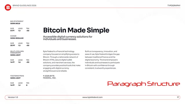
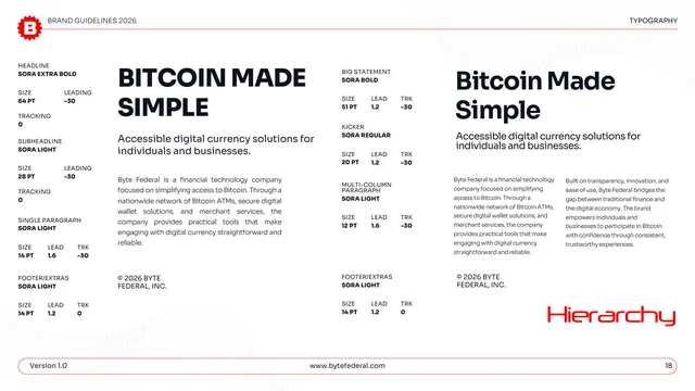
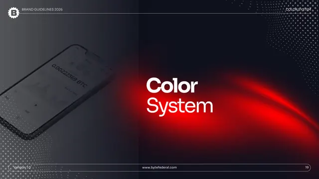
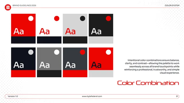
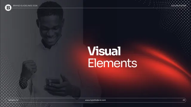
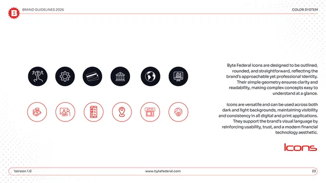
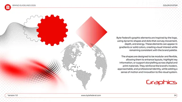
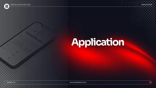
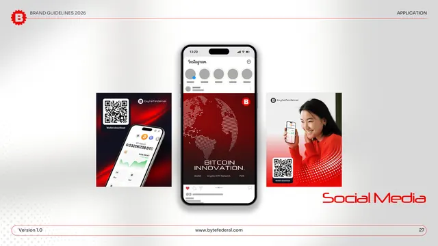
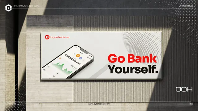
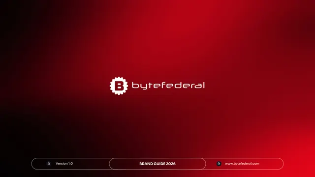
The deck alternates two page modes. Section dividers are full-bleed dark slides with a phone product shot on the left, a red light-streak glow sweeping across a near-black field, and a large white two-line section title. Content pages flip to white with a thin red rule under a running header (a small gear-B icon plus "BRAND GUIDELINES 2026" left, the section name right) and a pill-shaped footer carrying the version, URL, and page number. Every content page is signed in the lower right by an oversized red display title set in the brand's futuristic Neuropol-style face. The primary logo is a red cog enclosing a blocky B beside a lowercase "bytefederal" wordmark. The palette is bold red EC0401 plus a ladder of deep neutrals (near-black 1E1E1E and 10111E, slate 363A41, gray 727272) and light gray D6D6D6. Type pairs Neuropol X (logo and display headers) with Sora (headings and body). Recurring graphic devices: a dotted/halftone world map, gear silhouettes, a rotated red diamond, and soft red glows. Application pages show social posts, business cards, and an out-of-home billboard reading "Go Bank Yourself."
Key takeaway
The two-mode rhythm (dark cinematic dividers with a red light-streak, white utilitarian content pages) gives a long deck clear chapter breaks without losing consistency. The oversized red display title parked in the corner of every content page is a strong, cheap signature that ties unrelated layouts together. The single saturated red against a deep-neutral ladder is a disciplined fintech palette that stays high-contrast on both light and dark.
Reuse notes
A strong reference for crypto, Bitcoin, or fintech brand systems that want energy and authority at once. The red light-streak divider and dotted-globe motif suit any tech brand leaning on a "global network" story. Reach for it when a guideline needs obvious section navigation across many pages. Caveat: the look leans heavily on one loud red, so it needs careful contrast management and works best where bold and serious are both wanted.
From this deck: Byte Federal Brand Guidelines 2026
View deck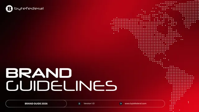






More like this







Keep what you find
A free account saves references to boards and can send you a weekly email of picks based on what you save.
To see every result, go Pro.