
Preview image. Unlock full-res
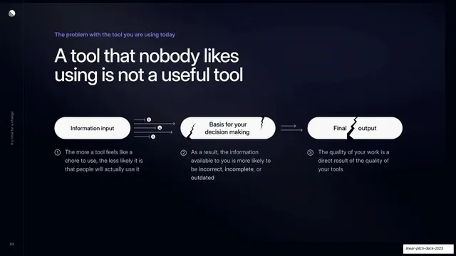
Problem slide stating current issue trackers are a chore, with three icon-led columns of pain points on a connecting hairline.
Summary
The problem statement: current issue trackers feel like a chore, broken into three icon-led columns of complaints sitting on a single connecting line.
Visual description
Dark background. A small violet eyebrow "The problem with the tool you are using today" sits above an oversized two-line white headline "Your current issue tracker feels like a chore to use". The lower half holds three evenly spaced columns, each topped by a circular dark icon (a frowning face, a loading spinner, an alert mark) connected left to right by a thin horizontal hairline. Under each icon is a bold white sub-head and a short bulleted list with small violet dash markers: "Cluttered UI" (Hard to navigate / Feature bloat / Riddled with bugs and UX papercuts), "Painfully slow" (Long loading times / Unresponsive), "Complicated workflows" (Adds overhead and busy work / Not designed for engineering teams).
Key takeaway
Framing the problem as three named categories on one connecting line, each with a single expressive icon and a tight bullet list, so the complaint reads as structured rather than a rant. The hairline tying the three icons together makes them feel like one system of pain.
Reuse notes
A clean problem slide for any B2B or SaaS pitch that wants to enumerate competitor or status-quo pain points. Three columns is the comfortable maximum at this type size; more would crowd. Sets up a mirrored solution slide well.
From this deck: Your current issue tracker feels like a chore
View deck






More like this







Keep what you find
A free account saves references to boards and can send you a weekly email of picks based on what you save.
To see every result, go Pro.