Preview image. Unlock full-res
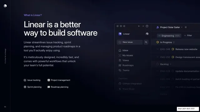
Split intro slide with a violet eyebrow, oversized headline and feature list on the left and a Linear app screenshot bleeding off the right edge.
Summary
The product intro: a left text column explaining what Linear is, paired with a large Linear app screenshot that bleeds off the right edge of the slide.
Visual description
Dark background split into a text column on the left and a product screenshot on the right. The left column leads with a small violet eyebrow "What is Linear?", an oversized two-line white headline "Linear is a better way to build software", two short grey paragraphs of body copy, then a small 2x2 grid of labeled capabilities each with a tiny icon: Issue tracking, Project management, Sprint planning, Roadmap planning. The right half shows a realistic dark-themed Linear app UI (left nav with Inbox, My issues, Views, Roadmaps, Teams; an issue list under "Project Solar Sailer" with In Progress, Backlog, and Icebox groups and ENG-numbered rows), cropped so it runs off the right edge of the slide.
Key takeaway
The classic split intro: a tight text column on the left doing the explaining and a real product screenshot on the right doing the showing, with the screenshot bled off-canvas to imply there is more app than fits. The 2x2 icon-label grid compactly previews the feature set without a wall of text.
Reuse notes
A reliable second slide for any product or SaaS deck that needs to answer "what is this" with a screenshot. Needs genuinely clean product UI; the bleed-off crop only works if the visible portion reads clearly. Pairs naturally with a following problem slide.
From this deck: Linear is a better way to build software
View deck



More like this








Keep what you find
A free account saves references to boards and can send you a weekly email of picks based on what you save.
To see every result, go Pro.