Preview image. Unlock full-res
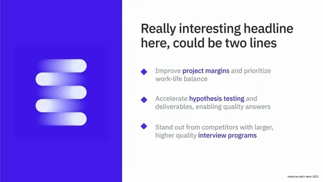
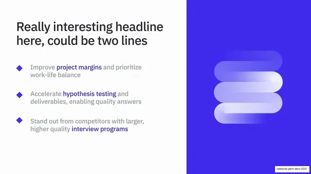
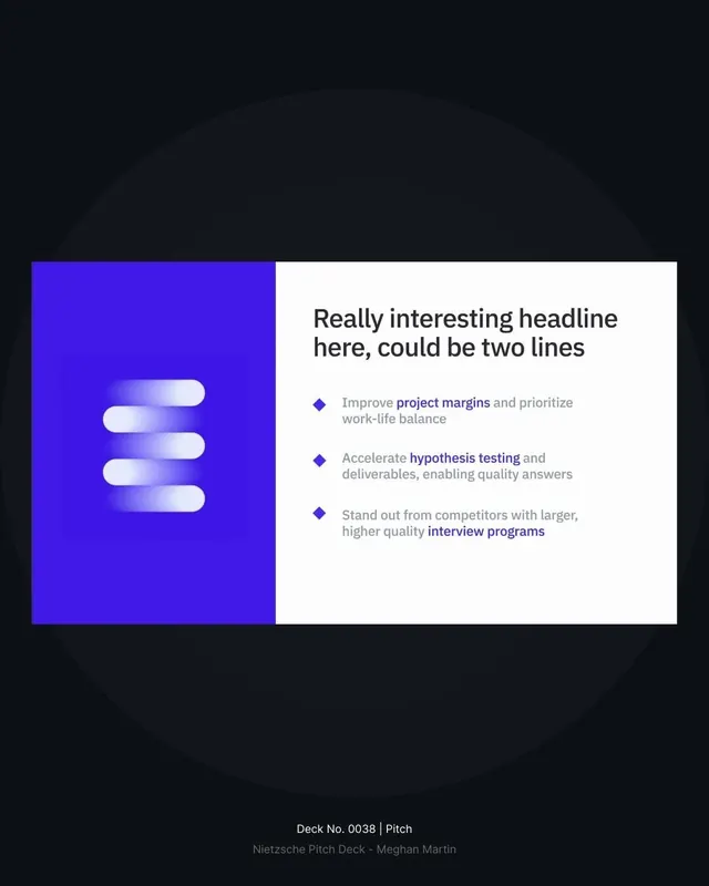
Mirror of the earlier benefits split, with the glowing 3D indigo mark on a vibrant blue left panel and headline plus three diamond bullets on a white right panel.
Summary
A mirrored benefits split: a vibrant electric-blue left panel holding a glowing 3D indigo logomark, beside a white right panel with a two-line headline and three diamond-bulleted points.
Visual description
The reverse of slide 6. A vibrant electric-blue (#3A2BF0) panel takes the left third, holding a soft-edged 3D render of the brand mark, a stack of three rounded white-to-indigo gradient bars, glowing inside a darker squared vignette. The white right two-thirds carries a large two-line navy headline ("Really interesting headline here, could be two lines") above three list rows, each led by a small indigo diamond bullet, each one to two lines of grey body with a single indigo keyword phrase ("project margins", "hypothesis testing", "interview programs").
Key takeaway
Flipping the same split layout to create rhythm across a section without inventing a new template, keeping the 3D mark, accent diamonds, and inline keyword highlights identical so only the orientation changes. The mirror reads as intentional pacing, not repetition.
Reuse notes
Use as the bookend partner to slide 6: same content, sides swapped, ideal for alternating benefit or feature pages. Headline is placeholder; the highlighted-keyword bullets are the reusable substance. Like its twin, the color panel needs a real 3D or product asset. Note the gallery caption frames this as the vision close, but the visible layout is the benefits template.
From this deck: Benefits split slide with 3D mark (text right)
View deck





More like this





Keep what you find
A free account saves references to boards and can send you a weekly email of picks based on what you save.
To see every result, go Pro.