Preview image. Unlock full-res
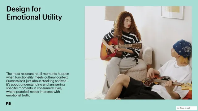
A mint-green split slide with a left headline and caption beside a right photo of two people playing guitars in a relaxed home setting.
Summary
A split recommendation slide on mint green: a left "Design for Emotional Utility" headline and caption beside a right photo of two people playing guitars together in a relaxed, sunlit home.
Visual description
Mint-green (#A9D9C9) background. Top-left, the two-line headline "Design for Emotional Utility" in a large black grotesque sans, with a multi-line supporting caption low in the left column. The right half is a softly lit lifestyle photograph of a woman in a striped top playing an acoustic guitar in an armchair while a person in a bandana plays bass on the floor beside her, in a calm domestic interior. The black "FS" monogram sits bottom-left.
Key takeaway
Matching an "emotional utility" recommendation to an intimate, low-key domestic photo where functionality (the instruments) meets feeling, on the same consistent recommendation template that runs through the chapter.
Reuse notes
A reusable recommendation slide. Quiet, emotionally warm photography suits messages about feeling and meaning. Keep the caption concise and the layout aligned with the chapter's other recommendation slides.