Preview image. Unlock full-res
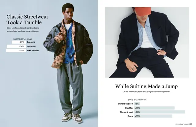
Side-by-side comparison contrasting declining streetwear and rising tailoring brands, each pairing a model photo with a mint YoY bar chart.
Summary
A two-panel comparison: declining "Classic Streetwear" at left and rising "Suiting" at right, each panel pairing a model photo with a mint-green YoY bar chart.
Visual description
The slide splits into two mirrored halves on the off-white ground. The left panel leads with a two-line serif headline "Classic Streetwear Took a Tumble", a short intro, and a horizontal bar chart with negative percentages and bold brand labels on the right (Supreme -25%, Off-White -34%, Nike Jordans -35%); a full-height photo of a model in a bomber and grey trousers sits beside it. The right panel carries a photo of a man in a navy suit above a serif headline "While Suiting Made a Jump", a one-line intro, and a bar chart of positive percentages (Brunello Cucinelli +5%, Dior Men +35%, Giorgio Armani +44%, Zegna +33%) in the same soft mint. The two charts read as a falling-versus-rising pair.
Key takeaway
Using one slide as an explicit up-versus-down comparison, with the same mint bar-chart device on both sides so the contrast is read instantly through bar direction and sign. Mirroring the headline-chart-photo structure left and right makes the opposition feel deliberate and balanced.
Reuse notes
Reusable for any winners-versus-losers, before-versus-after, or grew-versus-declined comparison. Keeping both charts in the identical style and scale is what sells the contrast. Each half needs its own supporting photo; works best with an even number of bars per side.
From this deck: Classic Streetwear Took a Tumble vs Suiting Made a Jump
View deck











More like this








Keep what you find
A free account saves references to boards and can send you a weekly email of picks based on what you save.
To see every result, go Pro.