Preview image. Unlock full-res
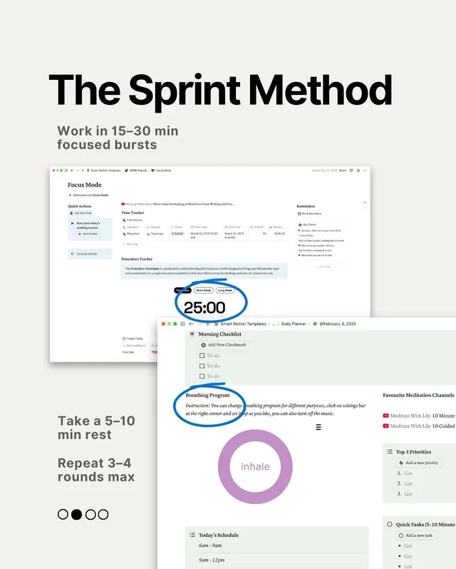
Layered dashboard mockup for a focused work timer app combining Pomodoro intervals, time tracking, breathing exercises, and task checklists into one calm interface.
Summary
A layered mockup dashboard for a focused work timer combining Pomodoro intervals, time tracking, breathing exercises, and task checklists into one serene, muted interface.
Visual description
The layout stacks multiple transparent card mockups on a beige background, showcasing an application's different screens. The title "The Sprint Method" appears in bold black type at the top left, with subtitle instructions: "Work in 15-30 min focused bursts", "Take a 5-10 min rest", "Repeat 3-4 rounds max", and a progress indicator (filled/empty circles). The mockup cards display: a Focus Mode section with Quick Actions and a Time Tracker table (columns for Task, Time, Status, dates); a Pomodoro Tracker section with a centered blue-outlined circle timer displaying 25:00; a Morning Checklist with a repeating "Add New Checkmark" field and expandable tasks; a Breathing Program instructional card with a large purple circular progress ring labeled "inhale"; a schedule block showing times and event labels; a Reminders section listing work-related items and key times; and on the far right, a sidebar with meditation channels, top priorities list, and quick-task input. Colors are restrained: warm-white background, steel blue accents, muted purple, cool grays, dark brown text. Sans-serif typeface throughout.
Key takeaway
The calm, multi-section card approach that shows features without overwhelming the layout. The high contrast of one bold sans-serif headline and clean input fields that make the interface feel both capable and approachable. The smart use of instructional text as left-side spine (instructions, rest timing, round count) that grounds the entire feature set.
Reuse notes
Strong reference for productivity apps focused on wellness (time management, focus sprints, meditation integration). The layered mockup approach works well for showing feature breadth in a single frame. Works best when the vertical rhythm and muted color palette reinforce "calm and focused" rather than energetic or playful.