Preview image. Unlock full-res
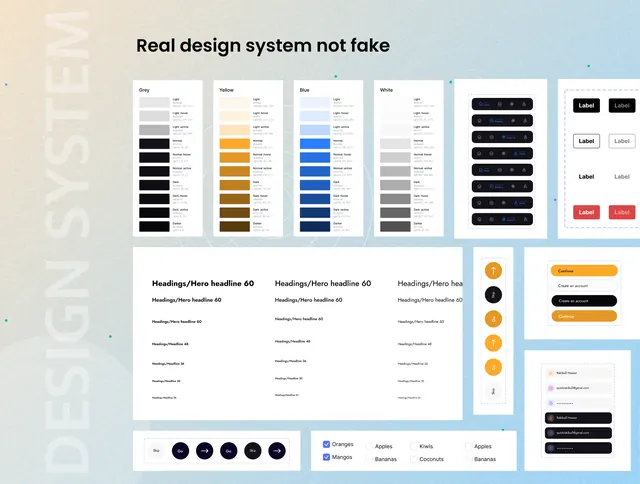
Design system documentation layout showcasing color palettes, typography rules, UI components, and patterns in a modular grid.
Summary
Design system documentation layout showcasing color palettes, typography rules, UI components, and patterns in a modular grid.
Visual description
A comprehensive design-system reference laid out in a structured grid across a soft blue-white background. Five color palette columns each display a vertical scale from light to dark (neutrals, orange, blue, muted, and grayscale tones). Below, three "Headings/Halo" typography specimen blocks show size and weight variations. To the right, a components panel displays label button states (default, disabled, selected) in navy and red, alongside circular avatar dots. A second components section shows button variations, checkboxes, and a two-column data table with orange and navy accent colors. The entire layout uses generous whitespace and clean sans-serif type (likely Helvetica or similar) with subtle grid lines.
Key takeaway
The systematic stacking of color scales and typography rules side-by-side makes complex design systems scannable. The pairing of tight component specs (buttons, labels, toggles) with looser palette documentation (full tint/shade ramps) shows a reusable template for design-team handoff docs.
Reuse notes
Essential for SaaS or developer-tool sites sharing design systems with teams or publicly. Works well as a landing page module, in onboarding flows, or embedded in design-system documentation sites. Pairs well with case studies or feature grids that show the system in action.