Preview image. Unlock full-res
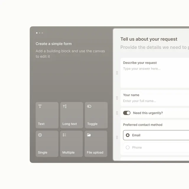
Split-panel form builder with component blocks (text, toggle, radio, file upload) on left and a live preview form on right showing input fields and options.
Summary
Split-panel form builder with component blocks (text, toggle, radio, file upload) on left and a live preview form on right showing input fields and options.
Visual description
Left panel shows a dark gray background listing six form-input component types in light boxes: Text, Long text, Toggle, Single (choice), Multiple (choice), and File upload, each with a simple icon. Right panel displays a white canvas with a live form preview: title "Tell us about your request", a text area for description, a name input field, a toggle for urgency, and radio buttons for contact method (Email selected, Phone unselected). Thin gray divider separates the panels. Typography is clean sans-serif, color palette restricts to off-white, light gray, medium gray, and black, creating a professional, minimal aesthetic focused on usability.
Key takeaway
Two-column interface that balances component palette against live preview, allowing simultaneous design and testing; generous white space and gray toning that creates visual separation without using borders; simple icons on component tiles aid quick scanning without decoration.
Reuse notes
Essential pattern for any form builder, survey tool, or no-code content editor. The neutral color scheme and clear labeling make this accessible to non-designers. Works equally well for email template builders, landing page creators, or questionnaire tools.