Preview image. Unlock full-res
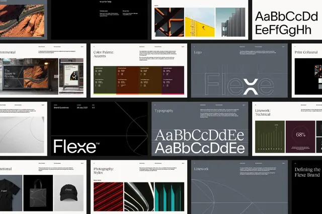
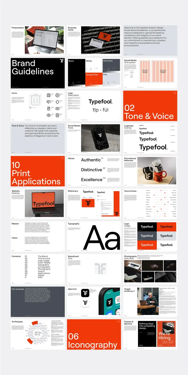
A professional branding identity with dark, light, and muted neutral palette, organized in a structured grid of type and mark studies.
Summary
A professional branding identity with dark, light, and muted neutral palette, organized in a structured grid of type and mark studies.
Visual description
A collage of branding elements arranged in a tight grid: type samples showing a clean sans-serif in various weights, mark variations in black and white, photographic textures (wood, fabric, gradients), and architectural imagery. The composition balances dark and light areas with generous white space around each element. Color is restrained to black, white, grays, and warm earth tones. The overall effect is sophisticated and print-forward, emphasizing consistency and system thinking over a single dramatic visual.
Key takeaway
The grid layout forcing consistency across disparate asset types; the use of texture and photography to add richness without breaking the monochrome palette; the clear hierarchy of type samples that show the identity's typographic voice.
Reuse notes
Strong reference for building a corporate identity system where the mark and type are equally important. Works for agency portfolios, design consultancies, and B2B brands seeking quiet authority. The restrained palette requires strong photography and texture to feel complete.
More like this

Keep what you find
A free account saves references to boards and can send you a weekly email of picks based on what you save.
To see every result, go Pro.