Preview image. Unlock full-res
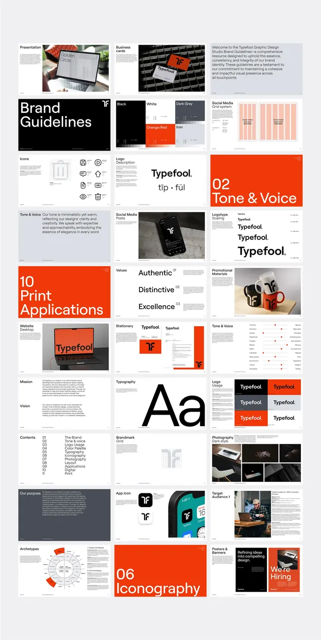
A comprehensive brand identity system with guidelines organized into a modular grid, showcasing logo applications, color palette, typography, and iconography in a single-page visual specification.
Summary
A single-page brand specification documenting logo applications, typographic hierarchy, color rules, and iconography in a tight modular grid, designed for internal and external stakeholder reference.
Visual description
A dense, landscape-oriented brand guidelines page organized as a grid of 12-16 cell tiles. Top row shows product photography and brand context. Left column: logo and wordmark usage (black and red variants), then a "Brand Guidelines" headline section with tonal copy. Center: typographic scale (headline weights, line-height callouts), iconic mark family (circle, cross, x symbols in grid), and a numbered set of applications (10 Logo Applications). Right: a vibrant red panel (branded color 02 - Tone and Voice), typography detail (Aa display), photography specifications, and iconography specimens. Each cell is crisply separated by white space; hierarchy is established through panel color (red focal points), type weight (display sans-serif for labels), and image/icon density. The palette is intentionally stark: black, bright red-orange, white, and neutral gray.
Key takeaway
The modular grid layout as a documentation strategy: breaking a complex system (6+ guidelines subsystems) into thumb-nail cells makes it glanceable and print-ready. The intentional use of one saturated accent color (bright red) on select panels to guide the eye. The paired use of display and body sans-serif weights to create clear caption hierarchy within tight spacing.
Reuse notes
Excellent reference for a corporate rebrand or system design document that needs to be comprehensive but digestible in one sitting. The grid is most effective in print or a full-page PDF. Not ideal for a multi-page guidelines site (use this as the summary page, with linked detail pages). Works well for B2B, corporate, and startup contexts; playful or illustrative brands may feel constrained by this rigid structure.
More like this


Keep what you find
A free account saves references to boards and can send you a weekly email of picks based on what you save.
To see every result, go Pro.