Preview image. Unlock full-res
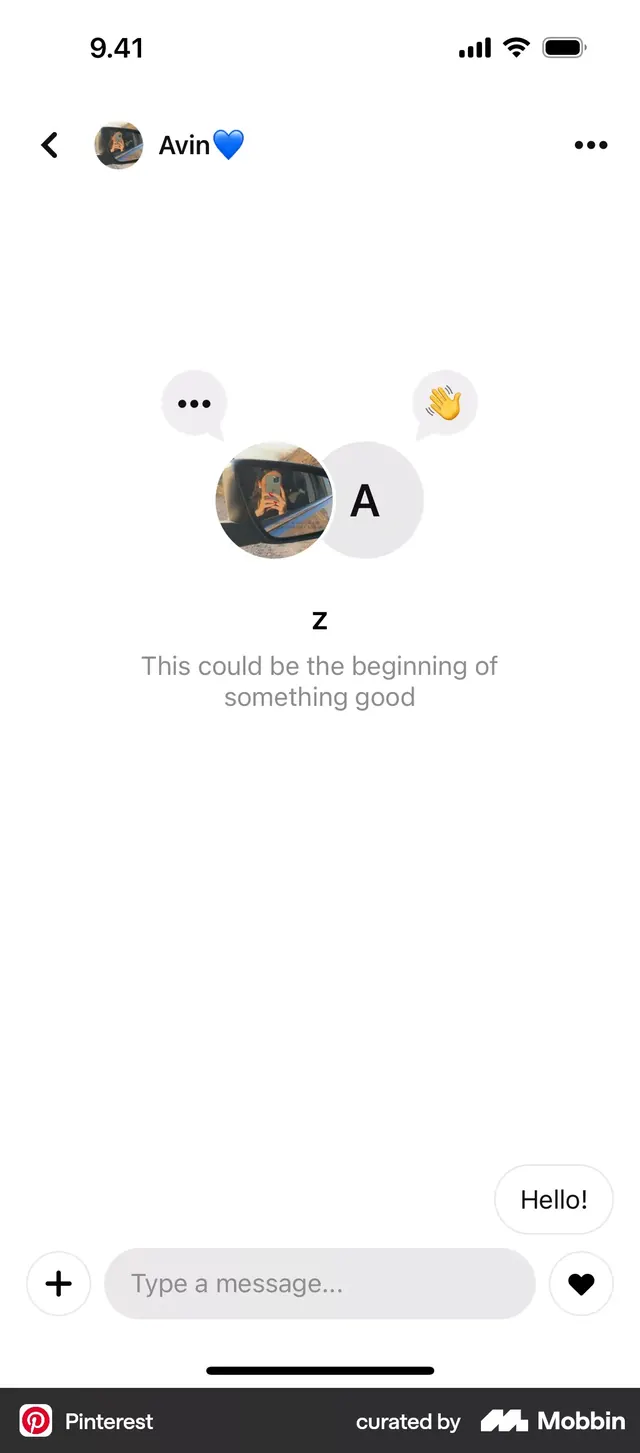
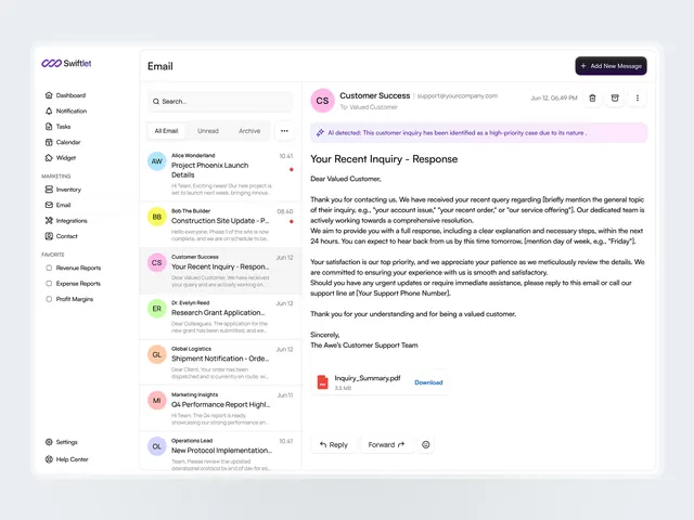
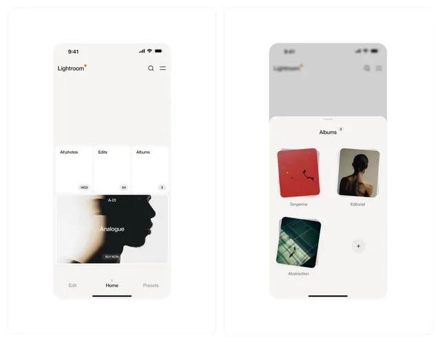
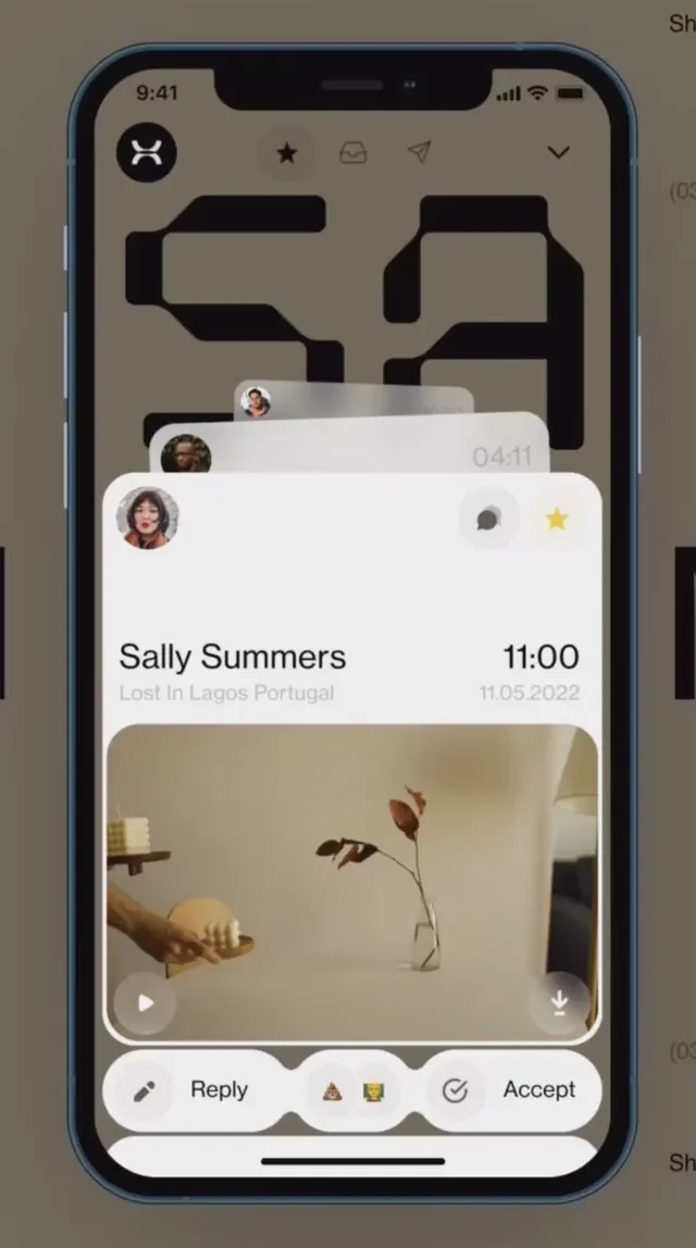
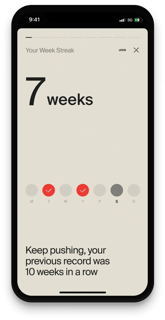
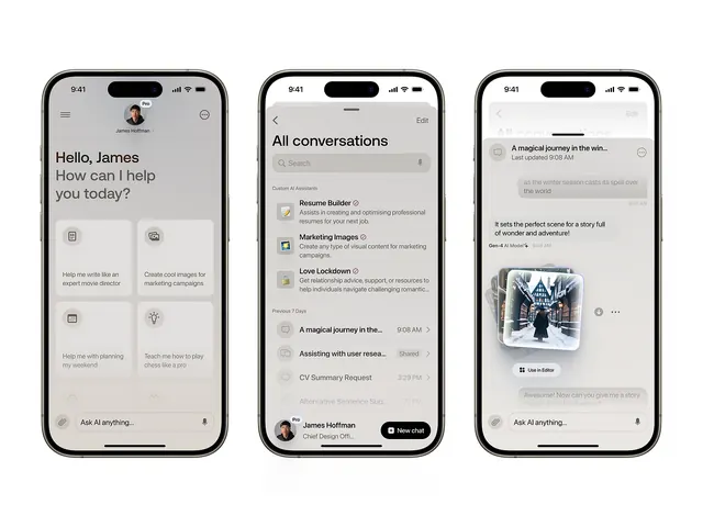
Minimalist mobile messaging interface with neutral palette, showing contact list, conversation thread, and rich media sharing across three distinct screens.
Summary
Three mobile screens showing a complete messaging flow: home with contacts and profile, conversation thread with list of chats, and detail view with rich-media sharing and timestamps.
Visual description
Left screen displays a home layout with "Hello, James" greeting, profile avatar at top, and a grid of action icons (call, video, info) below the headline. Center screen shows an "All conversations" list of chat threads with sender names, preview text, and timestamps. Right screen displays an expanded conversation detail with a shared image, metadata, and navigation controls. Throughout, the palette is exclusively neutral: off-white backgrounds, mid-gray text, dark accents. Sans-serif type is small and high-contrast. No color is used for semantic meaning, only hierarchy and breathing room.
Key takeaway
The extreme restraint with color and the use of typographic hierarchy alone to guide reading order across three related views. The contact grid on home screen (icon-based, no labels) as a compact alternative to text-heavy quick actions. The subtle use of rounded corners and whitespace for visual rhythm without clutter.
Reuse notes
Strong template for professional messaging, team collaboration tools, or secure-communication apps. The neutral treatment reads as trustworthy and serious. Works well when rich media (images, files) needs to share space with conversation text. Pair with system notifications or status badges if needed; the base design has room for subtle additions.