Preview image. Unlock full-res
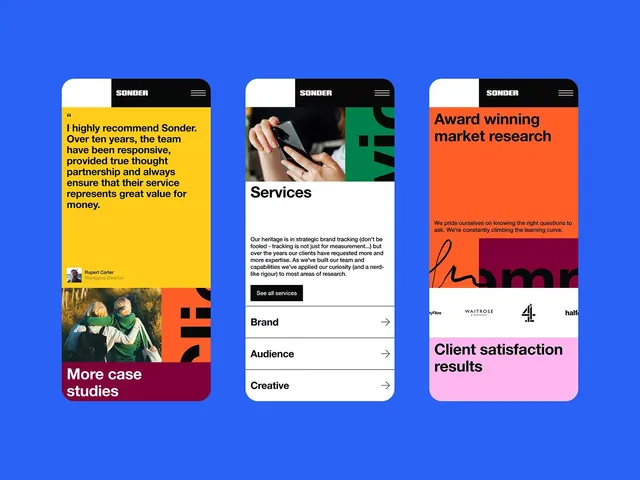
Three card-stacked web interface for a brand consultancy showcasing testimonial, services, and case studies with vibrant color-blocking and typography.
Summary
Three card-stacked web interface for a brand consultancy showcasing testimonial, services, and case studies with vibrant color-blocking and typography.
Visual description
Three full-height rounded rectangular cards arranged vertically and offset against a bright medium blue background. Left card features a yellow band with a testimonial quote from Rupert Carter (Managing Director) and a photograph of two people at the bottom, with "More case studies" in a burgundy band. Center card has a black header with "SONDER" branding and hamburger menu, white body section showing a product photo with "Services" heading and descriptive text, with green and black geometric shapes overlaid at the bottom, navigation arrows, and three expandable menu items (Brand, Audience, Creative). Right card features a bright coral-orange band reading "Award winning market research" with a curved red graphic element, white body with client satisfaction results in a pink band. All cards use bold, clean sans-serif typography with strong weight contrast between headlines and body text, crisp dark text on light backgrounds and white text on dark backgrounds.
Key takeaway
The offset stacking creates depth and visual rhythm without animation. The three distinct color zones (yellow, white, coral) paired with neutral black and white create maximum contrast and readability. Bold geometric shapes and asymmetric layout hold attention while maintaining functional clarity for information hierarchy.
Reuse notes
Strong pattern for service-oriented or consultancy websites that need to showcase multiple content types at once (testimonials, capabilities, work). The card-stacking technique works best on desktop or large tablet viewports. Color scheme suits professional B2B with friendly, confident energy. Modify card ratios or overlay the cards more/less depending on whether you want rhythm or dominance.