Preview image. Unlock full-res
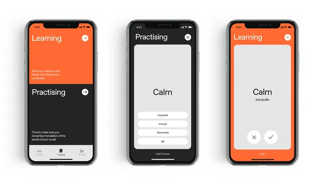
Mobile app UI with color-coded tabs (Learning/Practising) and a minimalist card-based drill flow for vocabulary training.
Summary
Mobile app for vocabulary practice with color-coded Learning and Practising tabs, accent-colored headers, and minimalist white card surfaces for drill content.
Visual description
Three phone mockups show the same app in different states. The left screen has a vibrant orange header labeled "Learning" with descriptive text below, followed by a darker "Practising" section with instruction copy. The center phone displays the "Practising" mode with a dark header, white card area centered showing "Calm" as the drilling term, supporting options listed below, and an "I don't know" button at the bottom in minimal style. The right phone mirrors the Learning tab layout, swapping in "Calm" with a French translation "tranquille" beneath, and paired checkmark and X buttons at the bottom for interaction. The color scheme alternates orange headers against black section dividers and white content cards, emphasizing task clarity through spatial and chromatic separation.
Key takeaway
The tab-driven mode toggle (Learning vs Practising) using color contrast and spatial hierarchy to signal context shift without navigation clutter. The white card float in the center of each screen focuses the user on the active drill term. The paired accept/reject buttons (checkmark/X) provide immediate, icon-led feedback without word labels.
Reuse notes
Strong for language-learning, tutoring, or quiz apps. The orange accent against black and white reads as energetic but not jarring. Works well for spaced-repetition drill patterns. Avoid if you need a full taxonomy of options; this scales best for binary or ternary choices per card.