Preview image. Unlock full-res
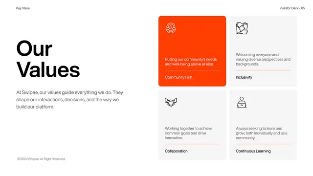
Company values section with left-aligned headline and descriptive text, a large orange card highlighting one value, and three cards below with icons and supporting copy.
Summary
A company values page for Swipee pairing bold headline typography with an orange accent card and supporting grid of icon-labeled value cards in muted gray.
Visual description
Left half of the layout contains a strong sans-serif headline, "Our Values", over explanatory body text describing how values guide decision-making. The right half shows a 2x2 grid: a dominant orange rounded card at top left displays an icon and core value statement, while three adjacent cards below and to the right each pair a simple line-art icon with a brief value title and supporting description. The cards use a light gray background, orange underline accents, and consistent spacing. Color palette is white, orange, and grays with black text.
Key takeaway
The visual hierarchy created by the oversized orange card standing apart from supporting secondary cards; the restrained icon use and careful typography weighting that lets content breathe; the underline accent as a subtle color callout within each card.
Reuse notes
Strong template for company mission or culture pages, team introductions, or value-driven narratives. Works best when the primary value is truly distinct or strategic. The orange-on-gray treatment reads warm and approachable without sacrificing professionalism; substitute the accent color for brand tone.