Preview image. Unlock full-res
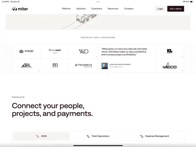
B2B SaaS landing page for contractor management platform featuring minimal white space, icon-driven product section, and customer testimonial cards.
Summary
Contractor management SaaS landing page with minimalist white layout, isometric truck illustration, customer logo wall, and product feature cards with icons.
Visual description
Horizontal navigation menu at top with logo, primary nav items (Platform, Solutions, Customers, Resources, Company), and right-aligned Login and Get a demo buttons. Below is a light beige hero section with centered isometric line-drawing of a truck with directional guides. Mid-page "Trusted by 1,000+ contractors" text leads into a 2x3 logo grid featuring construction company names, one testimonial card with photo and quote, and company logos. Lower section titled "Products" with bold headline "Connect your people, projects, and payments" followed by three product cards with icon, name, and description (HCM, Field Operations, Expense Management). All text is dark gray and near-black on white or very light backgrounds. Typography is clean sans-serif throughout.
Key takeaway
The balanced density of navigation and CTA without clutter; the isometric hero illustration used minimally to add visual interest while staying light; the testimonial card placement within a logo grid (social proof + credibility stacked efficiently); icon-plus-text product cards at footer with clear single-purpose headings.
Reuse notes
Strong template for B2B SaaS (construction, logistics, project management). The white-space-driven layout reads as trustworthy and professional. Works especially well for platforms targeting multiple roles (teams, contractors, management) where the Products section demonstrates breadth.