Preview image. Unlock full-res
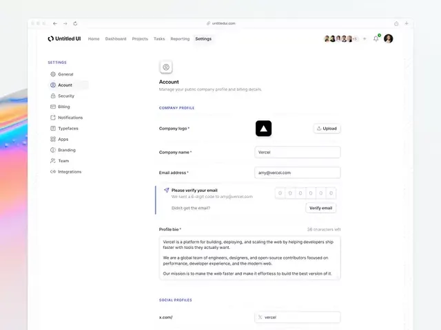
SaaS account settings interface with left navigation sidebar, organized form sections, and minimal visual hierarchy to reduce cognitive load.
Summary
SaaS account settings interface with left navigation sidebar, organized form sections, and minimal visual hierarchy to reduce cognitive load.
Visual description
Left sidebar navigation in light gray with icon-text menu items (General, Account, Security, Billing, Notifications, Typefaces, Apps, Branding, Team, Integrations). Main content area dominates the right side with an Account header, profile logo upload field, and stacked form inputs for company name and email address. A verification banner in light pink-purple sits between fields. All typography is sans-serif; spacing is generous; the overall palette is neutral whites, warm beiges, and subtle grays. The aesthetic leans institutional rather than playful.
Key takeaway
The sidebar-plus-main-panel structure for form-heavy settings screens. The verification banner pattern for breaking form flow with user guidance. Generous padding and hierarchical clarity through sparse visual elements.
Reuse notes
Strong pattern for SaaS account or workspace settings. Works well when handling sensitive profile or company data. The sidebar enables logical grouping of settings categories without overwhelming a single page.