Preview image. Unlock full-res
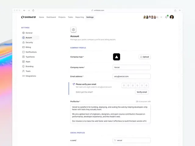
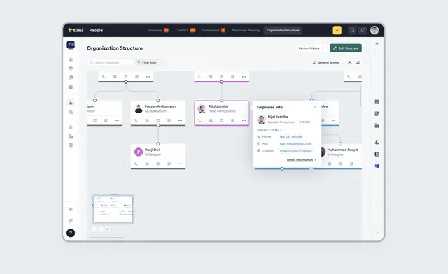
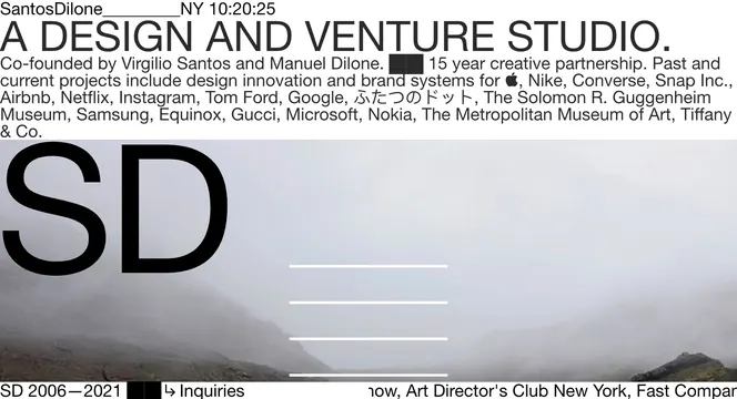
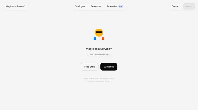
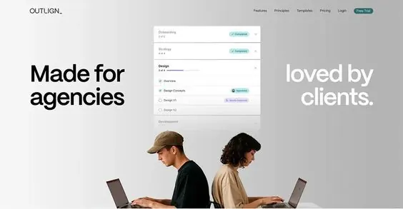
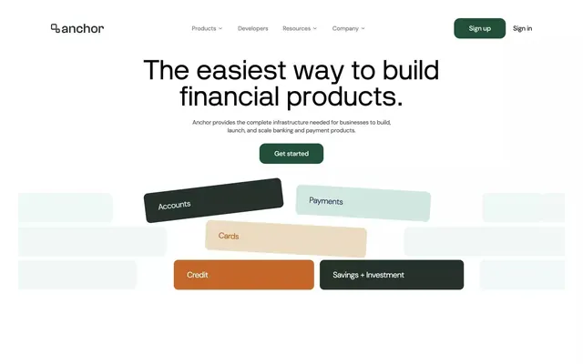
A clean, light-mode SaaS dashboard with sidebar navigation, data cards, and subtle typography hierarchy.
Summary
A contemporary SaaS dashboard interface with left sidebar navigation and a content area featuring data visualizations and metric cards in a clean, light aesthetic.
Visual description
Off-white background (#F5F5F5) with a persistent left sidebar in white. Sidebar contains navigation items in muted gray typography. Main content area displays data cards with metrics, charts, and statistics. Typography is sans-serif and minimal, with clear hierarchy between headers and body copy. Subtle shadows and spacing create visual separation between modules. The color palette is restrained: white, light gray, dark gray, and muted accent colors only. No decorative elements; purely functional design.
Key takeaway
The discipline of limiting to a neutral color palette and relying on clear typography and spacing to establish hierarchy. The sidebar-plus-content layout is a proven SaaS pattern that works at any screen width. Clean and timeless.
Reuse notes
Excellent starting point for any SaaS product dashboard, analytics tool, or internal application. The light mode works well for professional contexts. The minimal styling ensures it remains legible on mobile and responsive breakpoints.