Preview image. Unlock full-res
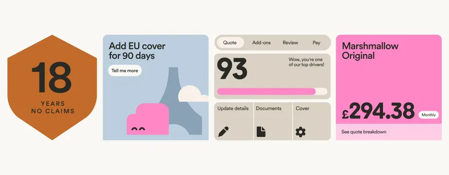
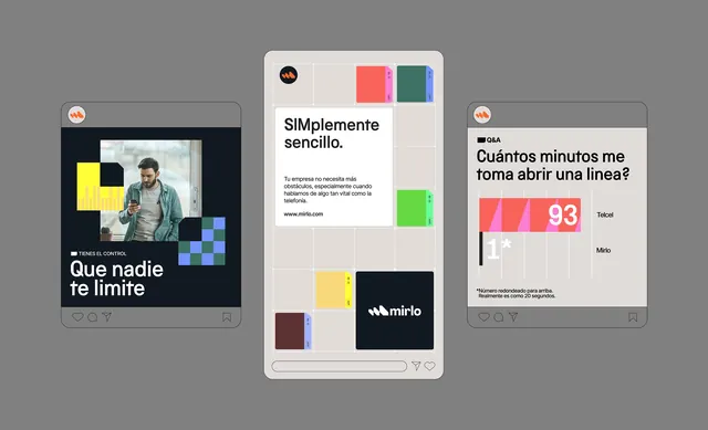
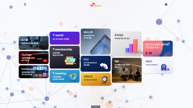
A scattered-grid dashboard with colored tiles and icons showcasing telecom or fintech services, each card containing brief text and a distinct color block.
Summary
A floating-card grid of color-blocked service tiles with icons and labels, each card a distinct hue, presenting telecom or fintech offerings in a playful, organized layout.
Visual description
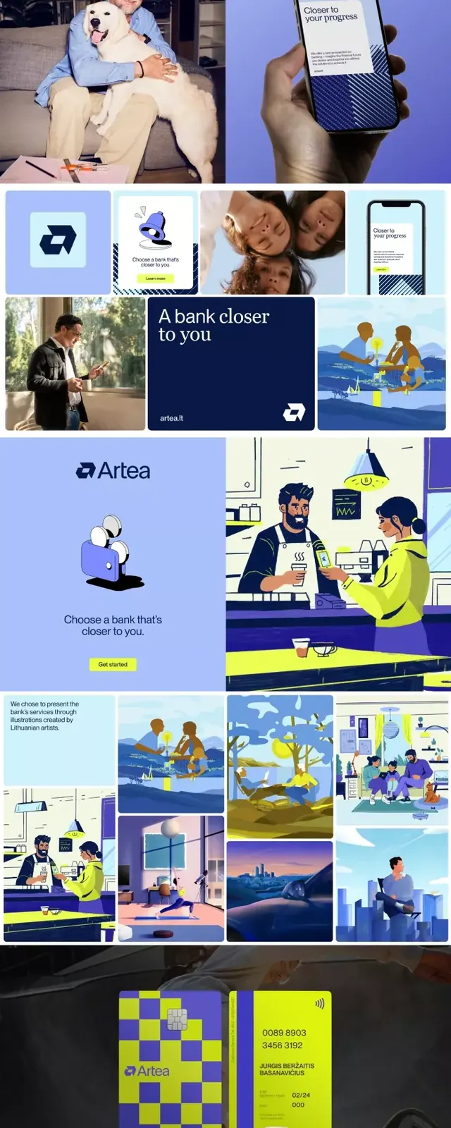
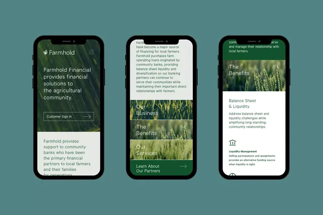
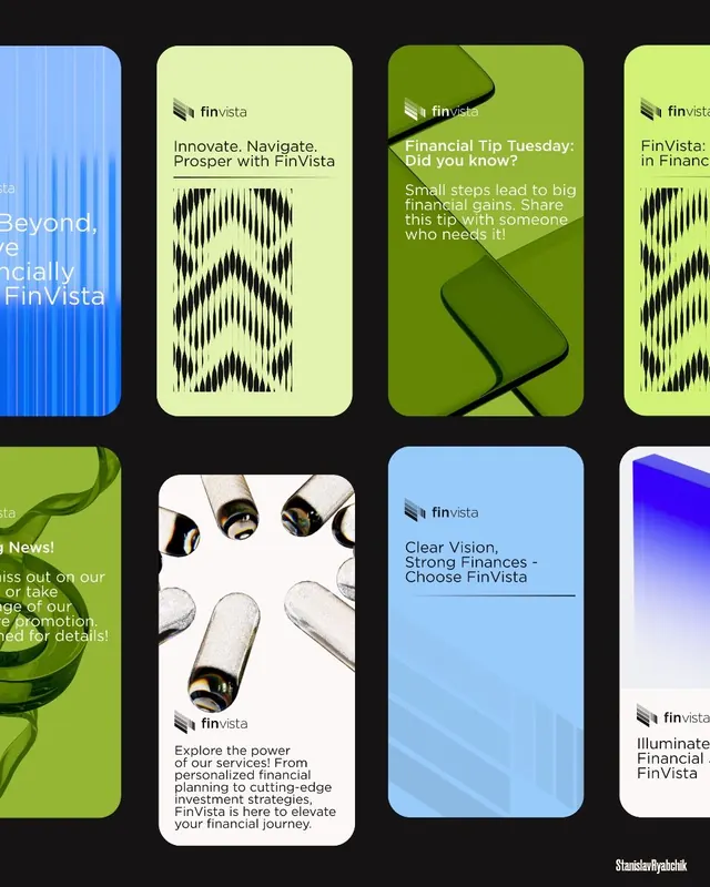
Light off-white background with scattered rectangular cards in shades of deep blue, navy, orange, teal, purple, pink, and gray. Each card contains a simple white or colored icon and 1-2 lines of small white or dark text. Cards are arranged in a loose, asymmetric grid with varied sizes (some single-width, some double-height). A few cards have subtle illustrated elements (phone, signal bars, building outline). Blue accent dots scattered across the background add lightness. At the top, a small red logo or wordmark. Sans-serif typeface in white or dark gray, sized for quick scanning. The overall composition suggests motion and modernity without rigidity.
Key takeaway
Loose card-based grids with varied sizing and floating backgrounds create visual interest while maintaining clarity. Each color-block reads as a category, reducing cognitive load for scanning many services. The distributed placement (not strictly aligned) and scattered accent dots give a sense of playful confidence suitable for modern fintech. Simple icon + label pattern is highly scannable on mobile.
Reuse notes
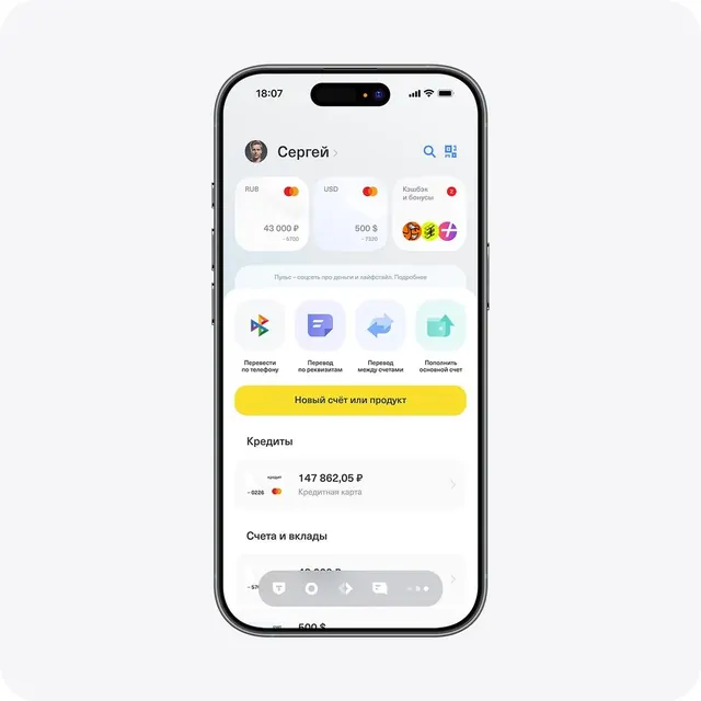
Ideal for service catalogs, feature grids, or app dashboards in fintech, telecom, or SaaS. The color-blocking by category makes sense when services are distinct (payments, transfers, analytics, billing). Works well on mobile and tablet. Pairs with straightforward CTAs and minimal typography. Color palette is professional but approachable, suitable for building trust in financial or telecom contexts. Avoid when information hierarchy is complex or data-dense.