Preview image. Unlock full-res
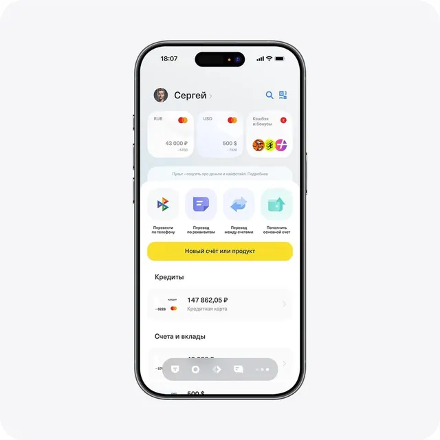
Mobile UI for on-demand services, stacking discrete service options as dismissible cards with soft gradients and inline CTAs.
Summary
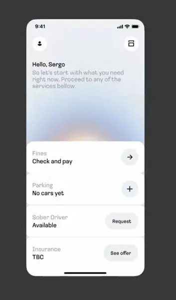
Mobile interface for a ride-booking app layering service options (driver availability, parking, insurance) as vertically stacked cards, each with its own status label and right-aligned action button.
Visual description
Light mode, predominantly white background with pale blue/gray tinted cards. A greeting headline "Hello, Sergo" sits above a soft peachy-orange watercolor gradient, followed by discrete rectangular cards in a vertical stack. Each card has: a category label in muted gray, bold black service name, status text ("Available", "No cars yet", "TBC"), and a right-aligned button ("Request", "See offer", or plus icon). Soft shadows separate each card from its neighbors. Status and action styling shifts subtly per card importance. Sans-serif typeface throughout, high contrast between text and background.
Key takeaway
The vertical card-stack pattern for multi-category option display. Each card is independently actionable without breaking visual continuity. The color hierarchy: gray labels > black names > muted status > accent button effectively guides focus without noise.
Reuse notes
Strong for fintech, consumer app booking flows, or multi-service utility apps. Works well when users have varied status states per option. The soft gradient above the stack softens the interface without competing for focus. Scale this pattern for 5-8 options; beyond that, consider tabs or collapsible sections.