Preview image. Unlock full-res
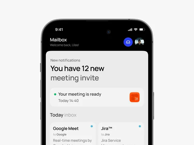
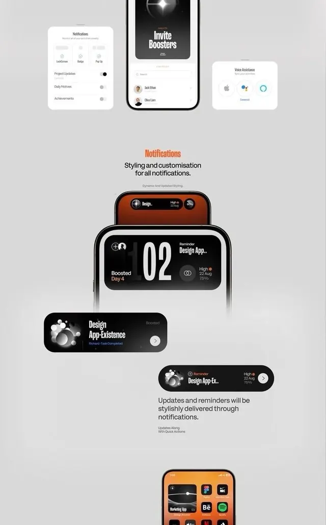
Multi-screen mobile notification design system with toggle controls, invite-booster call-outs, and dark notification cards stacked over light background.
Summary
A multi-card mobile UI showing toggles for Notifications, Badges, Pop-ups; a dark Invite Boosters flow; and stacked notification cards demonstrating reminder styling for a design app.
Visual description
The screen composition uses a light gray background with three sections: top cards display toggles (Lad&Rooms, Badge, Pop-Up) on a light surface; a center dark phone mockup shows an Invite Boosters screen with user avatars and a subtitle; and a bottom area showcases five stacked dark notification cards (black, dark gray, dark orange/brown) with white text, icons, and time badges (e.g., "Reminder Design App", "Boosted Day 4", "Design App: Existence"). Text is clean sans-serif throughout. Orange and blue accent dots appear in the UI cards. The layout is hierarchical and vertically stacked, emphasizing the progression of notification states.
Key takeaway
The toggle-and-card pattern clearly shows multiple notification states (on/off, different types) without overwhelming the user. The dark notification cards on a light background create strong visual separation and draw the eye to each message. The use of small accent icons (colored dots, user avatars) and concise labeling (time + action) makes the system scannable at a glance.
Reuse notes
Ideal for mobile apps that send frequent reminders, offers, or status updates. The dark-card-on-light approach works well when notifications compete for attention. The toggle system is useful for preference settings screens. Adapt the colors and copy to fit your app's tone; the structure is framework-agnostic. Works best paired with a clear notification-dismissal interaction (swipe or tap).