Preview image. Unlock full-res
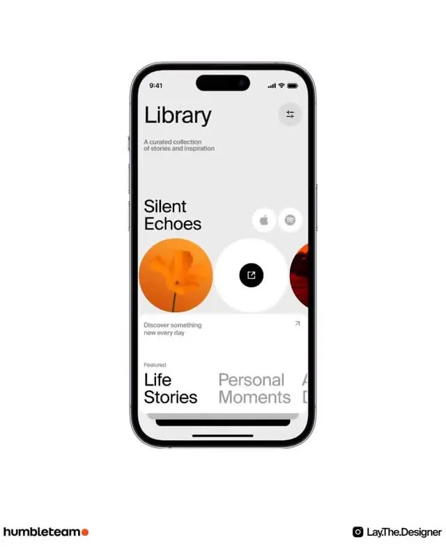
A content discovery app screen with oversized circular artwork thumbnails anchoring featured collections, minimal chrome, and subtle typography hierarchy.
Summary
A minimalist mobile content app (Library) with circular artwork cards as the dominant visual device, white background, and text-only navigation highlighting discovery and curated collections.
Visual description
Clean white screen with minimal interface elements. Large black headline "Library" anchors the top with a brief subtitle underneath. Two featured items displayed as prominent circular tiles (one orange, one white, one dark red cropped at edge), each about 120px diameter, arranged horizontally with icon overlays (Apple logo, play button, open-in-new icon). Below, larger heading "Silent Echoes" in heavy sans-serif introduces the current featured item. Descriptive copy "Discover something new every day" sits beneath. Two bottom sections labeled "Life Stories" and "Personal Moments" in mixed type weights (bold and muted gray) suggest tab navigation. Status bar shows 9:41, signal, and battery in standard iOS style.
Key takeaway
Use large, colorful circular artwork as the primary browsing element rather than grids or lists. Pair generous circular proportions with minimal UI chrome to make content feel curated and intentional. The oversize headline ("Silent Echoes") combined with small descriptive text creates confident hierarchy without needing buttons or dense controls.
Reuse notes
Excellent for media apps, podcasts, playlist apps, or any discovery-first experience where items are few enough to feature individually. Works best when circular art itself carries visual weight; scale down the circles if featuring many items (switches the UX from feature to browse). The minimal chrome approach demands high-quality imagery or the interface feels empty.