Preview image. Unlock full-res
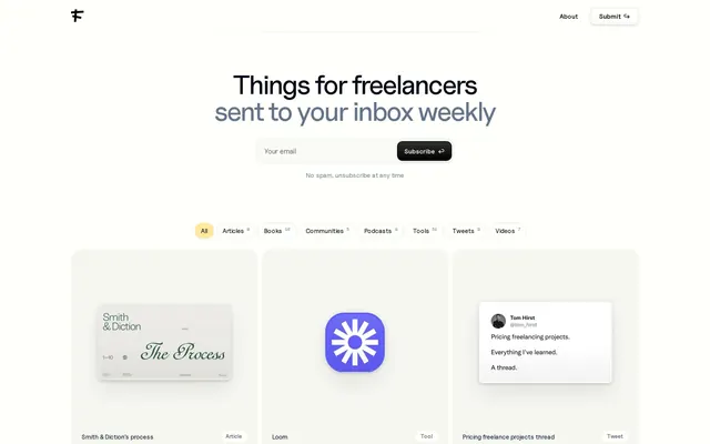
Minimal newsletter signup page for a freelance content aggregator with a centered email form, category filters, and a grid of curated content cards below.
Summary
Minimal newsletter signup page for a freelance content aggregator with a centered email form, category filters, and a grid of curated content cards below.
Visual description
A nearly white background with a small stylized monogram logo (blackletter F) in the top left. Top right navigation shows "About" and a "Submit" arrow link in clean sans-serif. The main headline stacks in black sans-serif ("Things for freelancers") over a smaller gray subheading ("sent to your inbox weekly"). Below sits a centered email input field with a black "Subscribe" button with an arrow. A reassurance line reads "No spam, unsubscribe at any time" in small gray type. Below that, rounded category pills in white with black labels (All, Articles, Books, Communities, Podcasts, Tools, Tweets, Videos) with small count numbers. A three-column grid shows content cards: one displaying a serif-heavy editorial design ("Smith & Diction: The Process"), a bright purple icon card (Loom), and a social-media card (tweet preview). Each card sits in a light beige container.
Key takeaway
Email form stacking (centered input + button side-by-side, reassurance text below) is direct and unambiguous. Category pill buttons with counts provide filter navigation without dropdown complexity. The grid of mixed card types (editorial spread, icon, social) demonstrates content variety without requiring long copy.
Reuse notes
Ideal for content aggregators, curated newsletters, or job boards targeting freelancers or professionals. White space and sans-serif type read clean on desktop; the form field width works well at tablet and down. Best when source content has strong visual identity (like the editorial cover), otherwise cards feel sparse. The serif accent in the editorial mockup adds personality; keep supporting images high-quality or swap for icon-only cards.