Preview image. Unlock full-res
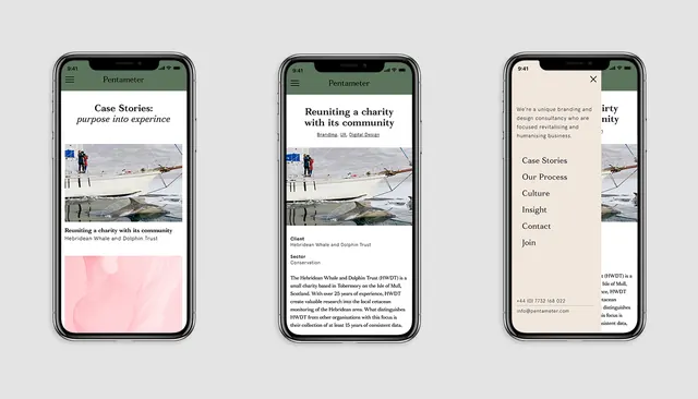
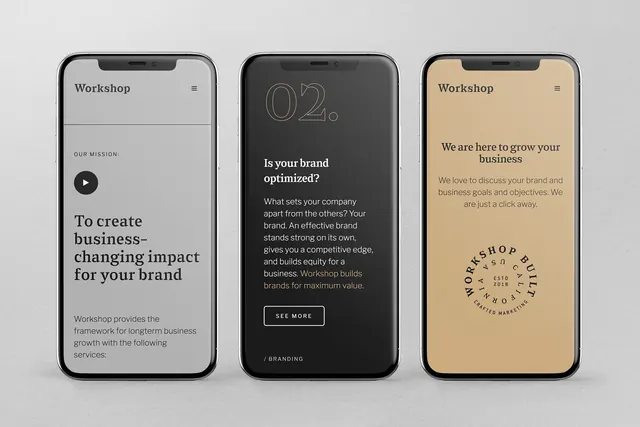
Three-screen mobile progression for a branding consultancy, pairing neutral tones with bold serif type and circular logo lockup.
Summary
A mobile app progression for a branding consultancy called Workshop, moving from mission statement to value proposition to service pitch across three screens in warm neutrals and serif display type.
Visual description
Three iPhone frames stacked horizontally. First screen: light gray background, left-aligned "Workshop" header with menu icon, play button icon, and large serif headline "To create business-changing impact for your brand" followed by body text on the service philosophy. Second screen: dark charcoal background, outlined step counter "02," large white sans-serif headline asking "Is your brand optimized?", descriptive body copy, white-outlined "SEE MORE" button, and "/BRANDING" label. Third screen: warm beige background, "Workshop" header, centered body copy "We are here to grow your business" with subtext, and a circular bronze/gold monoline logo lockup reading "WORKSHOP BUILT CUSTOM MARKETING 2018" near the bottom. All three use consistent sans-serif body text and generous vertical spacing.
Key takeaway
The clear three-act narrative structure (mission, value-prop, invitation) across consecutive screens. The careful typographic contrast between delicate serif display headlines and crisp sans-serif supporting type. Warm-neutral color blocking (light gray, dark charcoal, warm beige) creates visual separation without high saturation, making dense copy scannable on mobile.
Reuse notes
Strong reference for B2B services, branding, or consulting app onboarding flows. The serif-first treatment reads premium and editorial, suiting advisory services. Works best when each screen's copy and color shift reinforce a different stage of the user journey. Note the deliberate use of single CTAs per screen and consistent header treatment.