Preview image. Unlock full-res
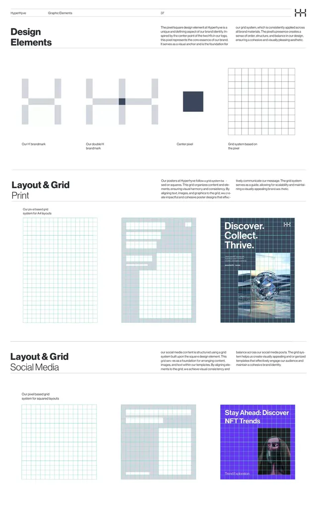
Design system documentation page showcasing geometric modular components, grid construction, and layout systems across print and digital media.
Summary
Design system documentation page showcasing geometric modular components, grid construction, and layout systems across print and digital media.
Visual description
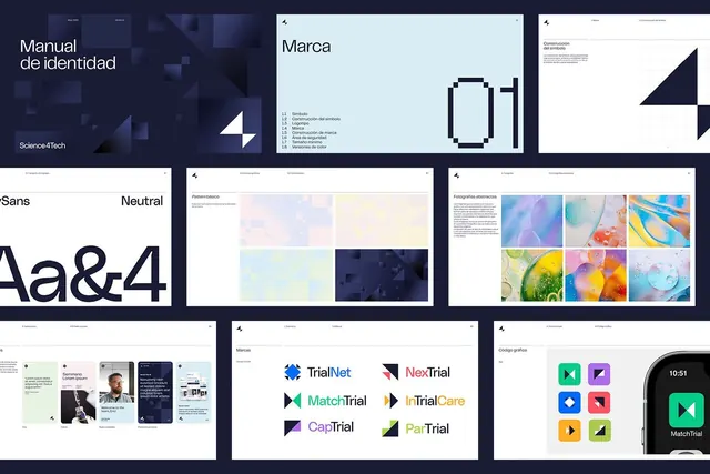
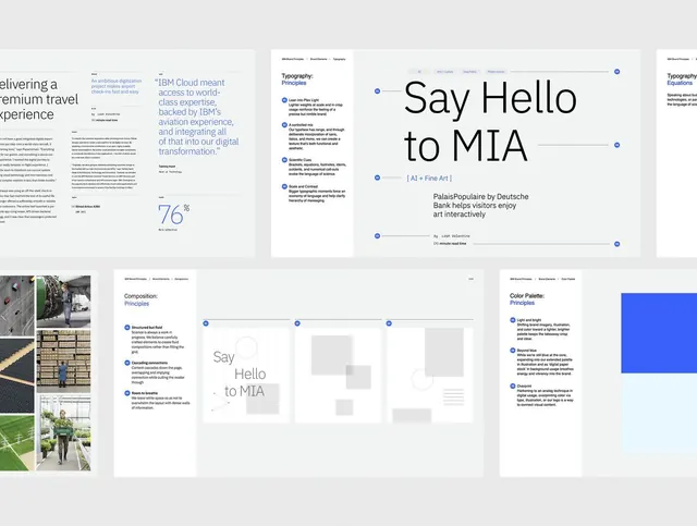
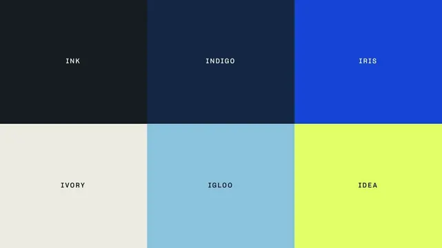
A structured documentation layout with a "HH" logotype and "Design Elements" heading. Two main sections show grid-based systems: the top half displays abstract geometric shapes (thin vertical rectangles, one filled dark square) labeled as font fundamentals and proportional system, alongside a fine grid pattern. Below, labeled "Layout & Grid Print", a series of grid templates show white space articulation, column systems, and margin diagrams in soft gray and light blue. A section titled "Layout & Grid Social Media" presents similar templates but with more color variation, including a dark navy and purple grid example featured prominently. All type is clean sans-serif; color palette uses white, light grays, cool blues, and one indigo accent.
Key takeaway
The systematic approach of presenting grid foundations separately from applied layout examples gives viewers a clear mental model. The color strategy uses cool neutrals as the primary language, with a single indigo accent color creating a focal point without noise. Showing the same grid concept across three contexts (print, social, digital) teaches flexibility while maintaining consistency.
Reuse notes
Ideal for design system or brand guidelines documentation when you need to explain grid logic and proportional systems to stakeholders. The geometric simplicity avoids looking dated. Best for b2b or portfolio contexts where credibility and systematic thinking matter. The multi-section layout works well for print-to-digital documentation; avoid if you need quick visual scanning (too much modular comparison can overwhelm).