Preview image. Unlock full-res
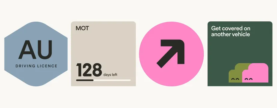
A horizontal four-card grid layout with distinctly colored geometric backgrounds displaying document categories (driving licence, MOT, insurance, vehicle renewal), each with icons and supporting text.
Summary
Four equally weighted modular cards arranged horizontally, each with a distinctive geometric shape and color, presenting document-management categories for vehicle and regulatory information.
Visual description
Light cream background containing four adjacent cards in a single row. From left to right: a rounded-hexagon in soft blue-gray containing "AU" in large sans-serif and "DRIVING LICENCE" label below; a cream-colored rounded rectangle with "MOT" label, "128" days counter, and a progress bar at bottom; a bright pink circle with a black arrow-turn icon centered; a dark forest-green rounded rectangle with white heading "Get covered on another vehicle" and small stacked geometric shapes (overlapping circles and pink rounded form) at the base. Each card employs sans-serif typography in varying weights and uses its background color strategically to anchor the text or icon. The overall composition balances four distinct information types through shape and color differentiation rather than visual hierarchy through position.
Key takeaway
The use of distinct geometric shapes (hexagon, rectangle, circle, rounded rectangle) as a mnemonic pattern for different information types, improving scannability without relying on icons alone. The color coding system that creates four visual lanes without hierarchy, allowing users to remember "the pink one" or "the blue one" as a mental shortcut. The progress bar inside one card as a secondary information layer that doesn't clutter the primary message. The mix of static labels (MOT, AU) with dynamic counts (128 days, data amounts) within a single card type.
Reuse notes
Ideal for vehicle-services, insurance, or financial-services dashboards where users need quick access to multiple document categories or account statuses. The four-card pattern works for any categorical breakdown (documents, alerts, services, settings) where visual differentiation is more important than textual hierarchy. The geometric shapes help reduce cognitive load in mobile contexts. Works best when the four categories are equally important; asymmetric information needs may require a different layout.