Preview image. Unlock full-res
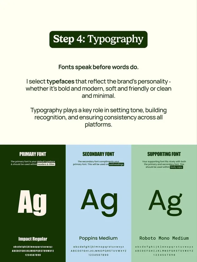
Typography guide showing three font pairings used in brand hierarchy: primary, secondary, and supporting fonts with specimen glyphs.
Summary
A typography system reference showing three distinct sans-serif font roles paired with color-coded sections and full character sets, designed for brand guidelines.
Visual description
Three vertical columns on a pale cream background, each assigned a different color band: dark forest green, light powder blue, and soft sage green. Each column showcases one typeface (Impact Regular, Poppins Medium, Roboto Mono Medium) with large specimen letterforms "Ag" below. Above the letterforms sit concise usage instructions: "Primary Font" (for headers and titles), "Secondary Font" (for subheadings), and "Supporting Font" (for body copy). Below each type specimen runs a complete lowercase and uppercase character set plus numerals in smaller size. Dark text and light backgrounds create crisp legibility; the color blocking creates visual rhythm.
Key takeaway
The three-column structure isolates each font's role with simple, memorable labels. Color blocking creates instant visual hierarchy without decorative flourishes. Full character sets on display build confidence in coverage and accessibility.
Reuse notes
Ideal for brand identity guides, design-system documentation, or type-pairing exercises. Works especially well when you need to show how primary, secondary, and supporting fonts collaborate across layouts. The color zones make it easy to extract individual font treatments for separate applications.