Preview image. Unlock full-res
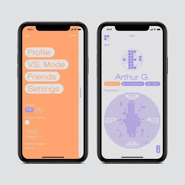
Split-screen mobile UI pairing a menu-driven profile section with an analytics dashboard using orange and purple tokens for visual separation.
Summary
Split-screen social app UI pairing a vertically-stacked menu on the left (orange background) with a member profile dashboard on the right (light background with purple tokens) to organize profile, modes, friends, and settings.
Visual description
Left screen: warm orange background with four stacked pill-shaped buttons (Profile, VS. Mode, Friends, Settings) in a lighter peachy tone, followed by language toggles, a circular avatar, Patreon and Instagram labels, and "Mentions Ignees" and year 2023 credits. Right screen: light gray background with a top back arrow, user "Arthur G." name in large sans-serif, three clickable tags (@arthurgio, le Niv Eclaireur, Pat 0.57), a hexagonal dot-pattern avatar above, and a large circular histogram-style chart in purple showing progression metrics (Eyewitness, Wildcard, Chaser, Cleric). The visual separation via color and border clear column division creates distinct functional zones.
Key takeaway
The color split (orange sidebar versus light main) as a spatial and cognitive divide between navigation and content. The hexagonal avatar and purple-dot histogram as custom data visualizations that distinguish a social-stats context. The pill-button treatment and generous padding for easy mobile touch targets.
Reuse notes
Strong for social apps, member dashboards, and personal stat presentations. The orange/purple pairing is vibrant without clashing. Works best when sidebar is secondary navigation and main column is the focus. On landscape screens, consider whether the layout remains scannable.